Why Vintage Graphic Tees Never Go Out of Style

There's a reason you still see guys wearing tees from the '80s and '90s — not because they found them in a thrift store, but because the design actually holds up. Classic American graphic tees have an honesty to them that modern fashion keeps trying to replicate and never quite gets right.
The formula was never complicated. A strong image. Worn-in type. A color palette that didn't need to be loud to be felt. And enough of a story in the design that you didn't need a brand name to tell you what it stood for.
That's the design language that built American streetwear before anyone called it that.
What Makes a Graphic Tee Vintage — and Why It Matters
"Vintage" gets thrown around constantly, but most of what's sold as vintage-inspired is just faded. Real vintage graphic design has structure. The imagery earns its place. The typography was drawn, not downloaded. The proportions were intentional.
Look at the graphic tees that survived — the ones people still hunt in vintage stores or keep in rotation decades later. They all have the same thing: a design that works as a visual object, not just a product label. A motorcycle club patch. A state championship. A local shop graphic from a town you've never been to. The connection isn't nostalgia. It's that the design was built to mean something.
That's what separates a vintage-inspired tee that works from one that's just distressed fabric.
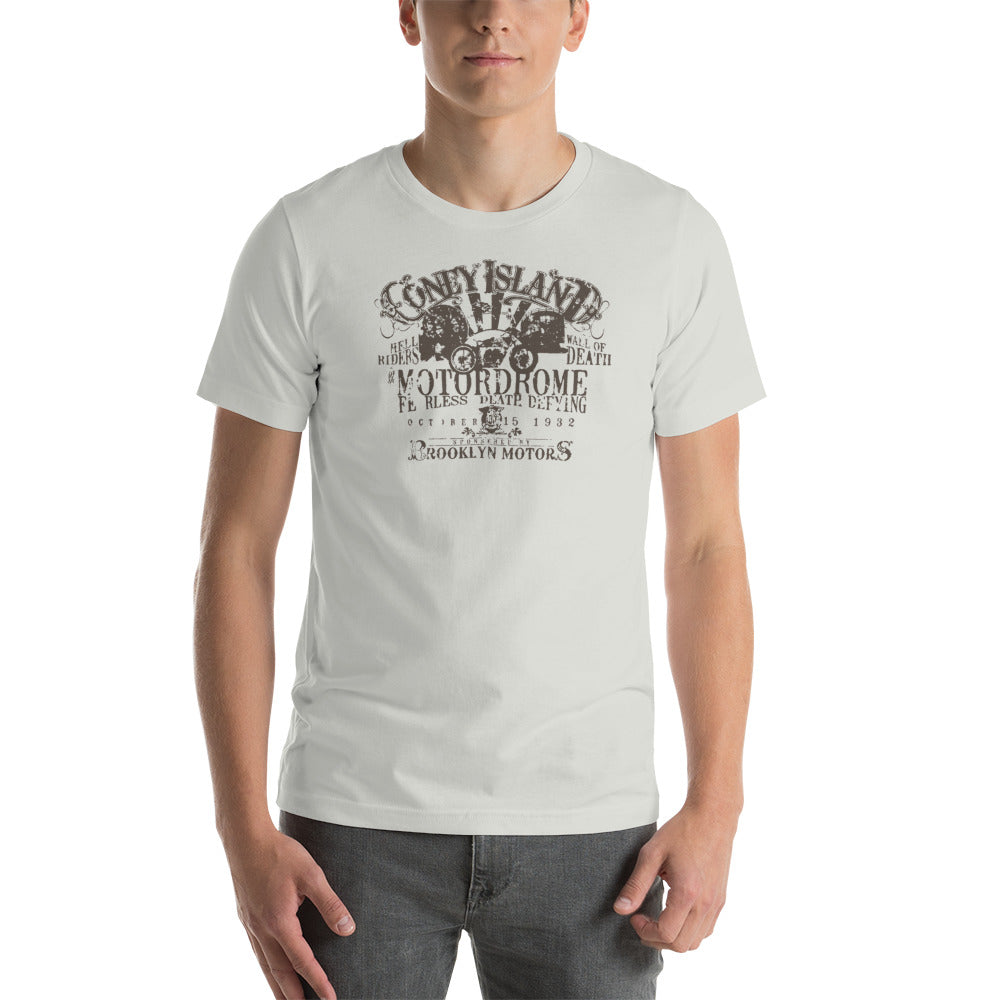
The Motor Club Aesthetic
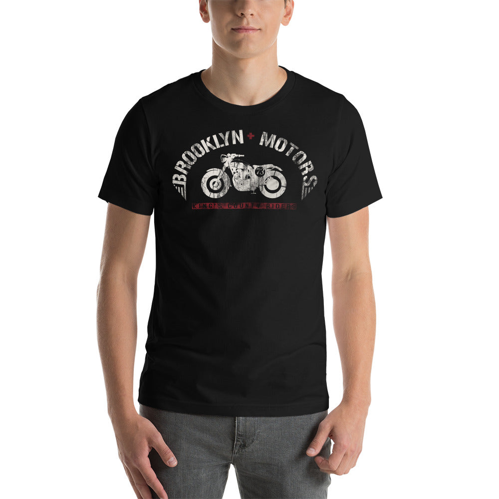
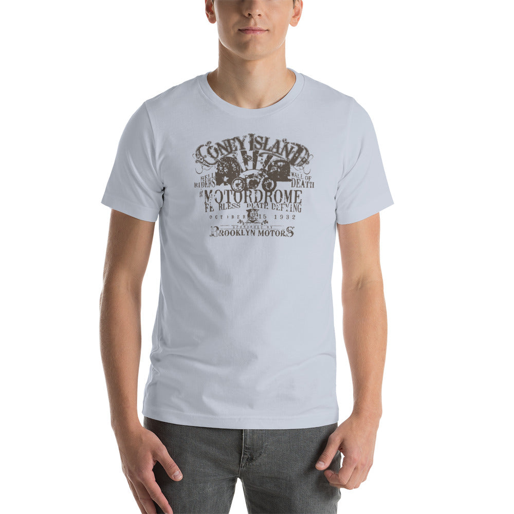
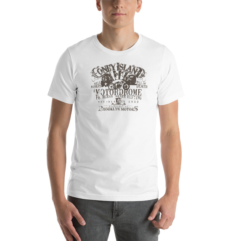
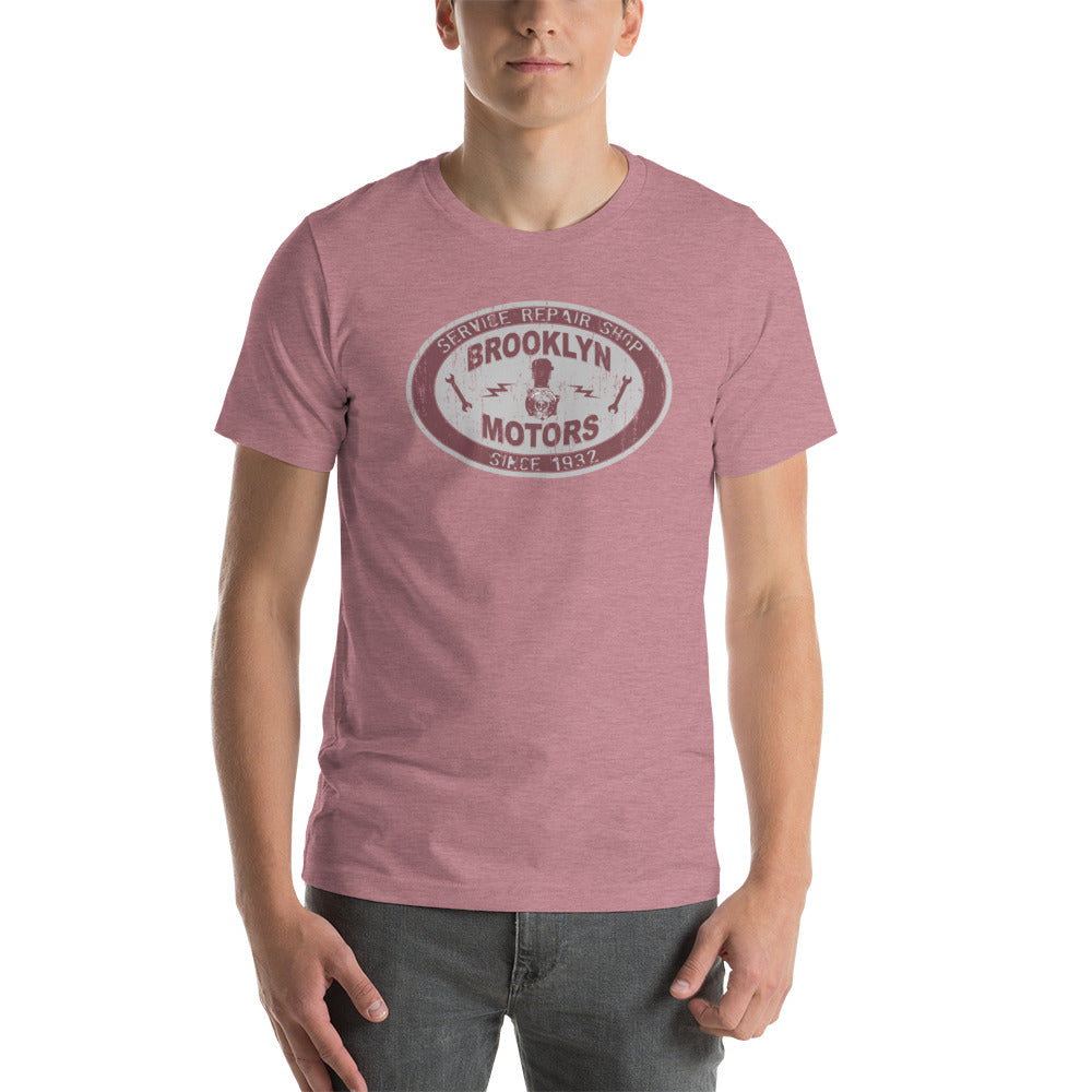
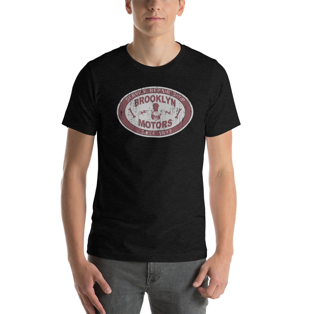
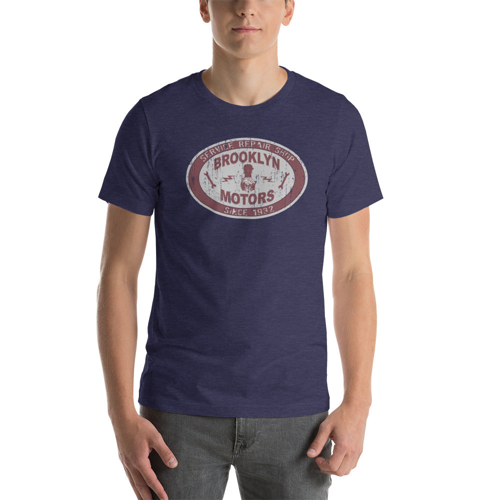
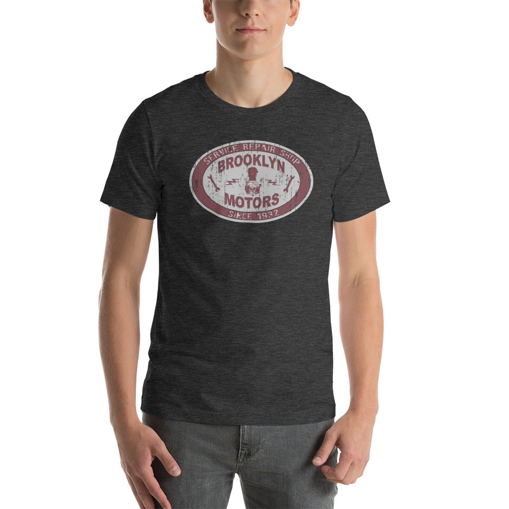
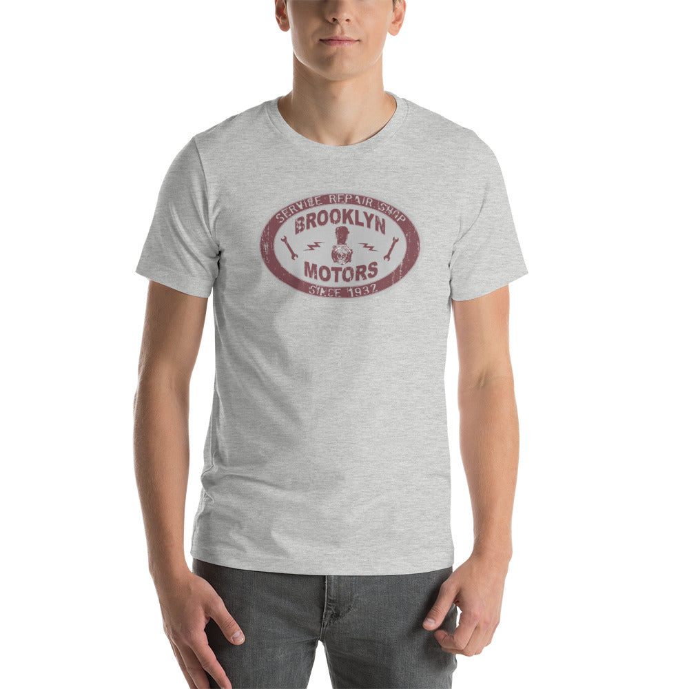
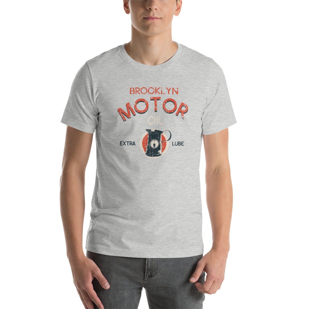
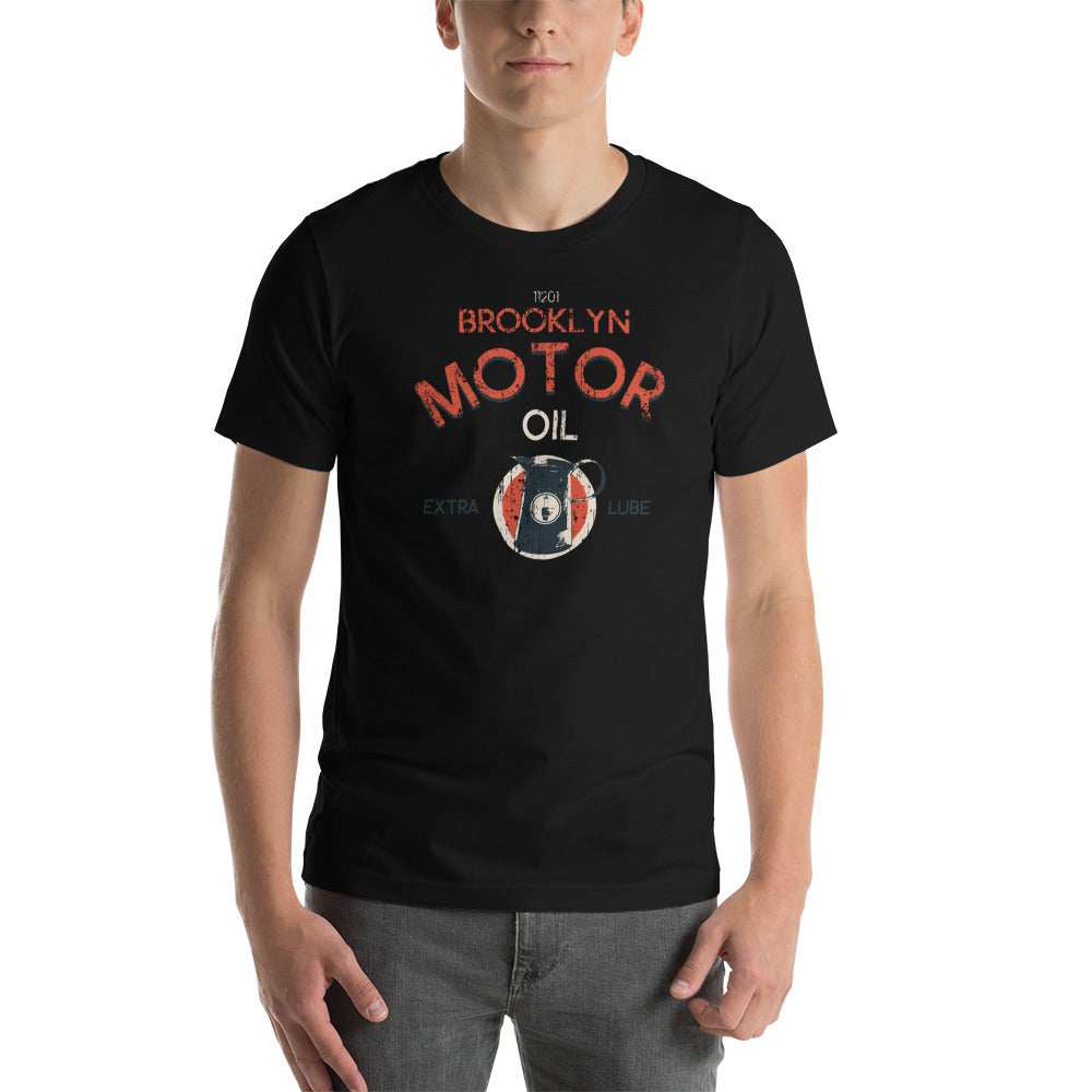
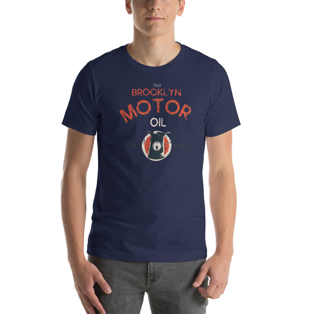
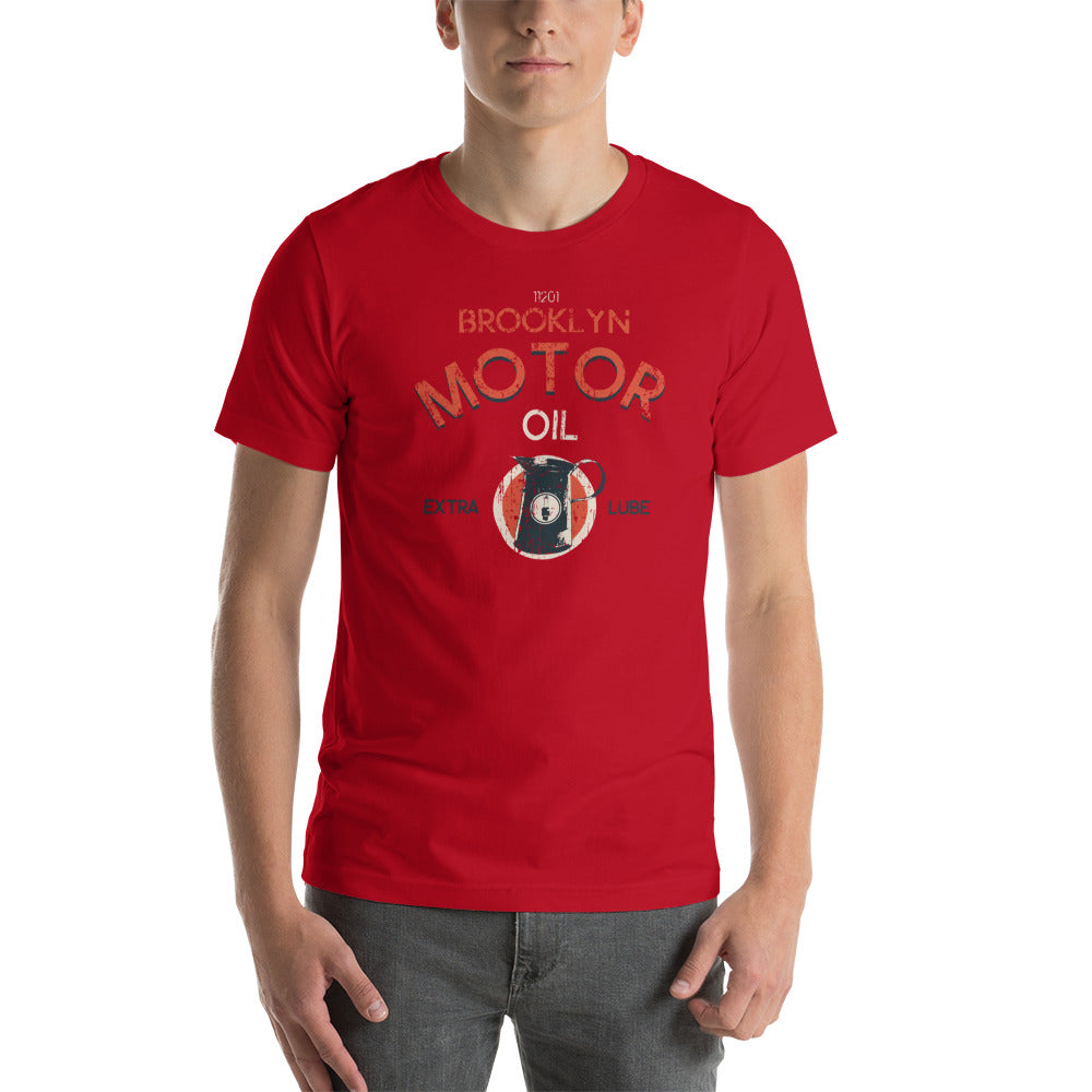
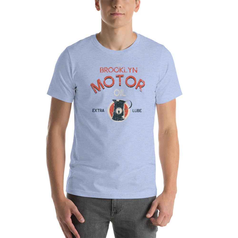
American motorcycle culture produced some of the best graphic design of the 20th century — and almost none of it was made by designers. It came from club patches, shop signage, race programs, and local pride. The visual language was direct: an emblem, a place, a year, a set of wings or wheels. No ambiguity about what it stood for.
That aesthetic never left. It just moved from the back of a jacket to the front of a tee.
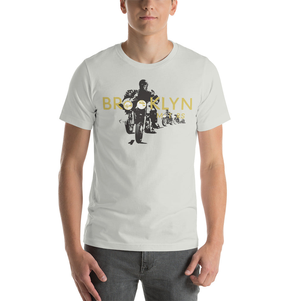
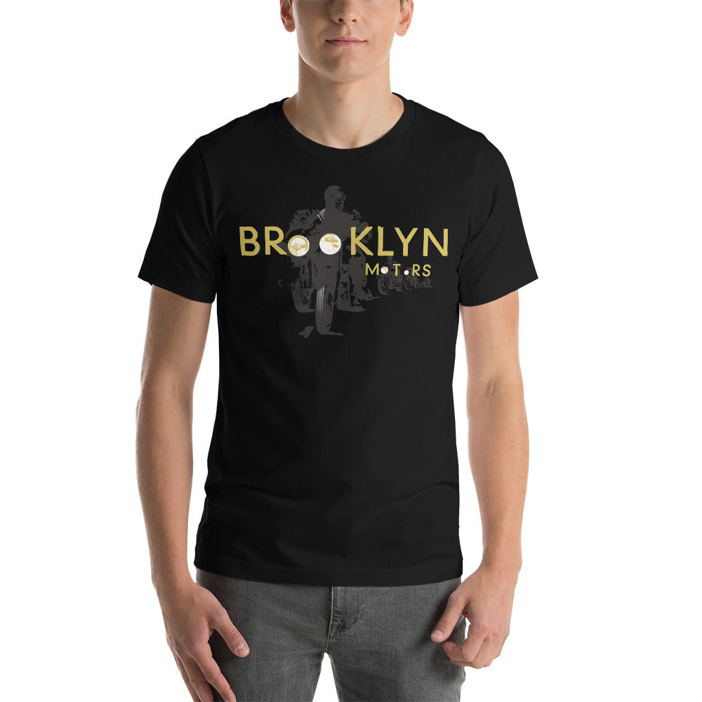
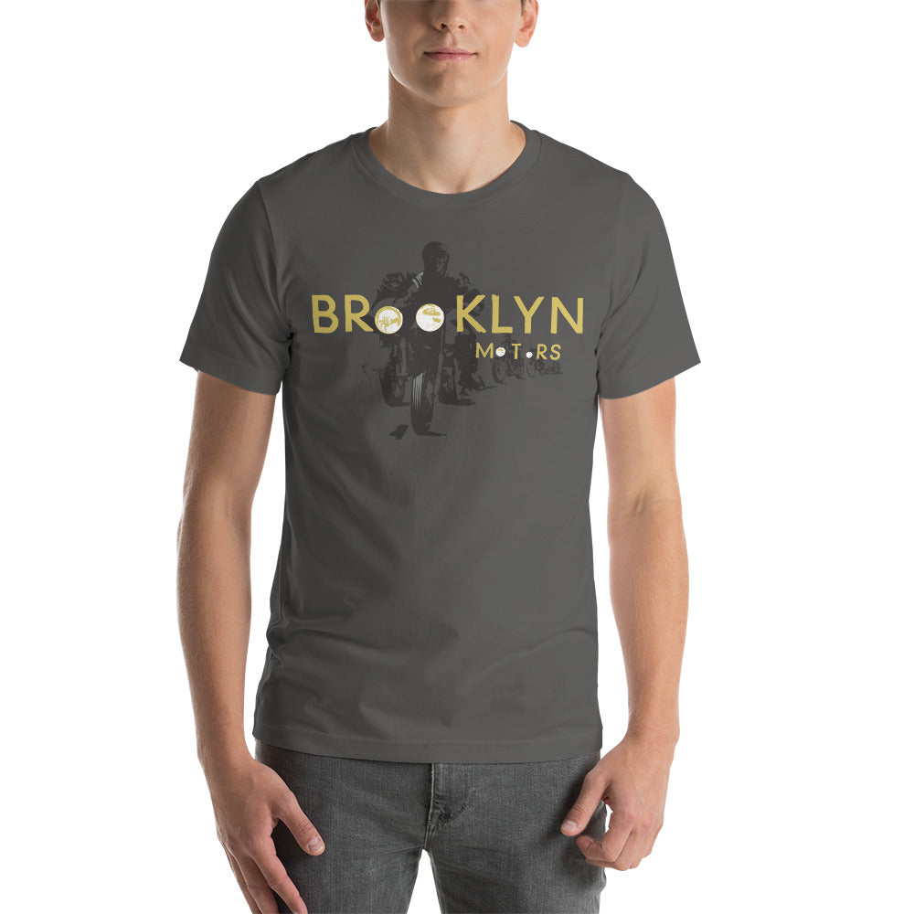
A graphic from a Brooklyn motor club hits differently than a logo tee because it's carrying actual cultural weight. The imagery isn't decorative — it's referential. When you see the circular badge, the ribbon banner, the classic chopper illustration, you're reading a visual shorthand that American culture has been fluent in for a hundred years.
That's not manufactured nostalgia. That's design doing its job.
Why DTG Printing Gets the Vintage Look Right
Here's something most people don't know: the subtle, worn-in quality of a great vintage-inspired graphic comes down to how it's printed.
BklynMotors tees are printed direct-to-garment (DTG) with water-based inks. DTG applies the graphic directly into the fabric — not on top of it. The result is a print that feels like part of the shirt: soft to the touch, breathable, and with a texture that reads as broken-in rather than slapped on. Water-based inks are absorbed into the fibers rather than sitting on top as a thick layer, which is what gives the print that faded, natural quality from day one.
It's the right technique for this kind of design. A plastisol screen print would make the same graphic look new and commercial. DTG makes it look like it's been somewhere.
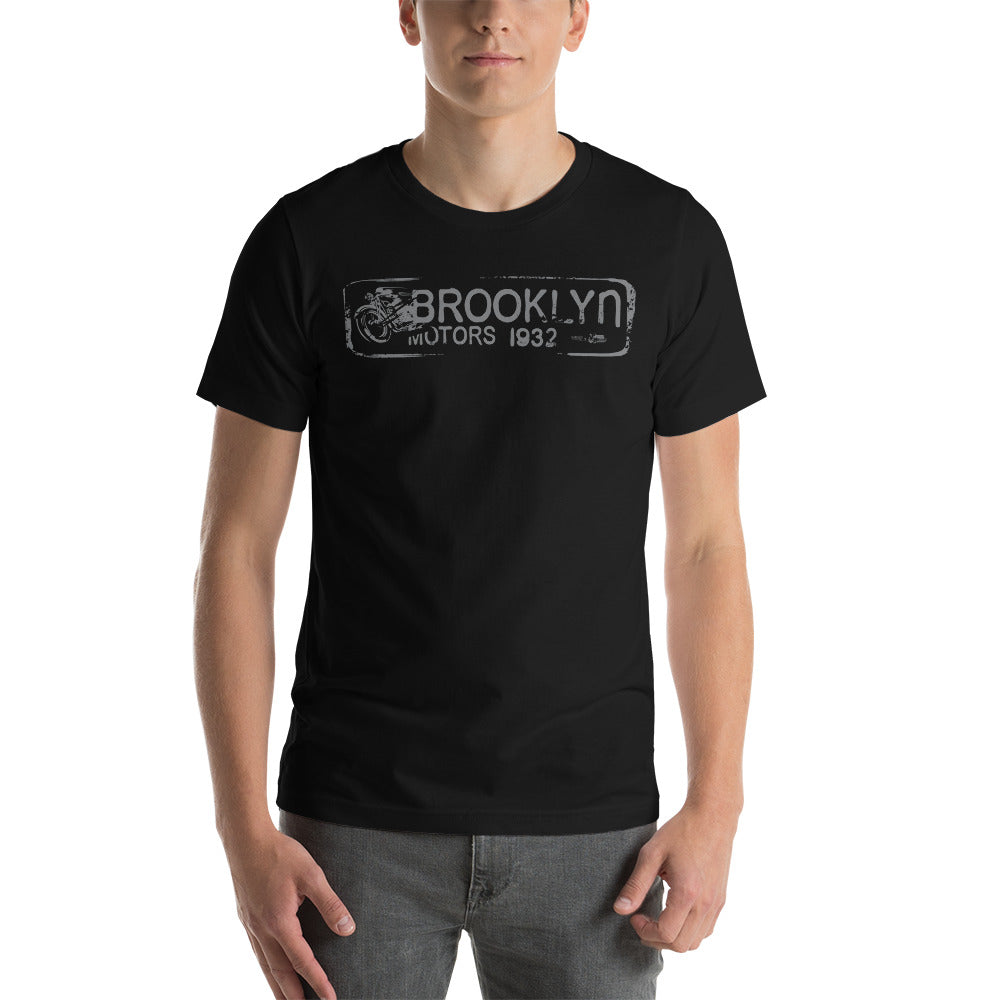
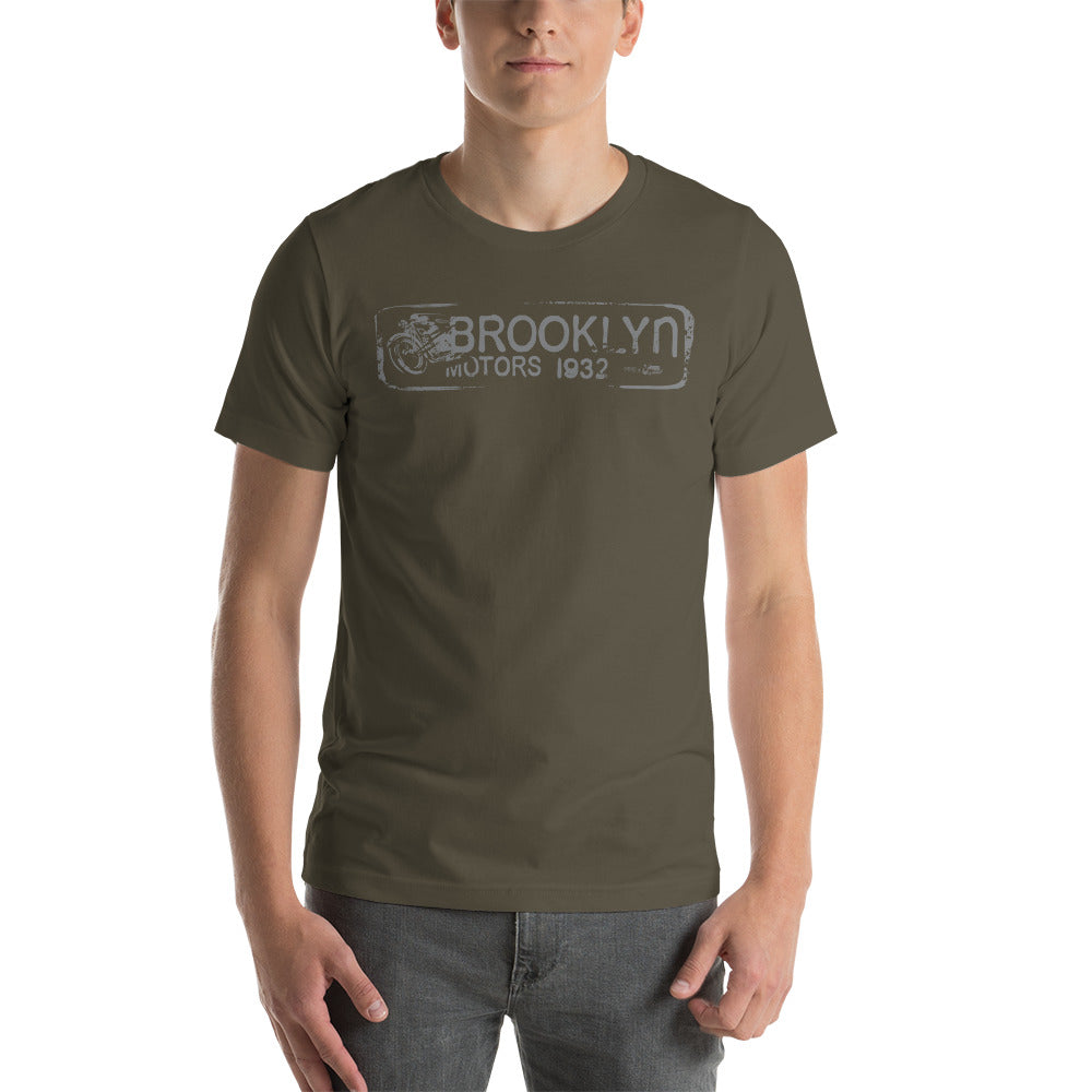
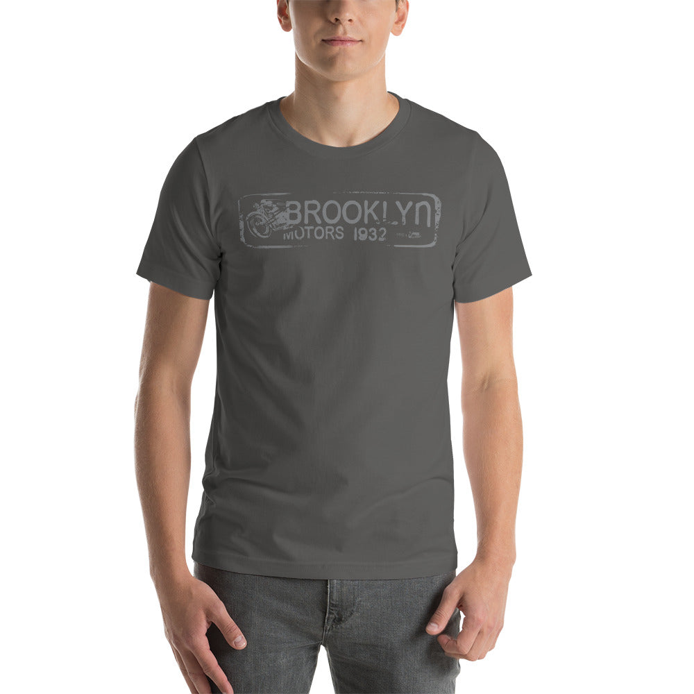
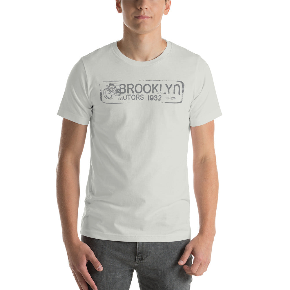
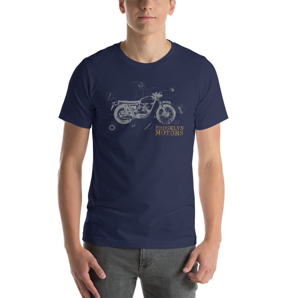
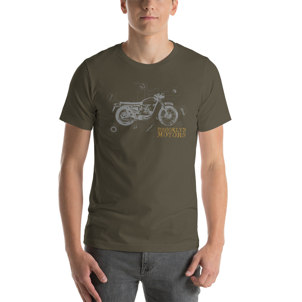
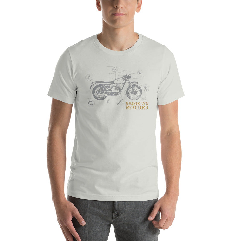
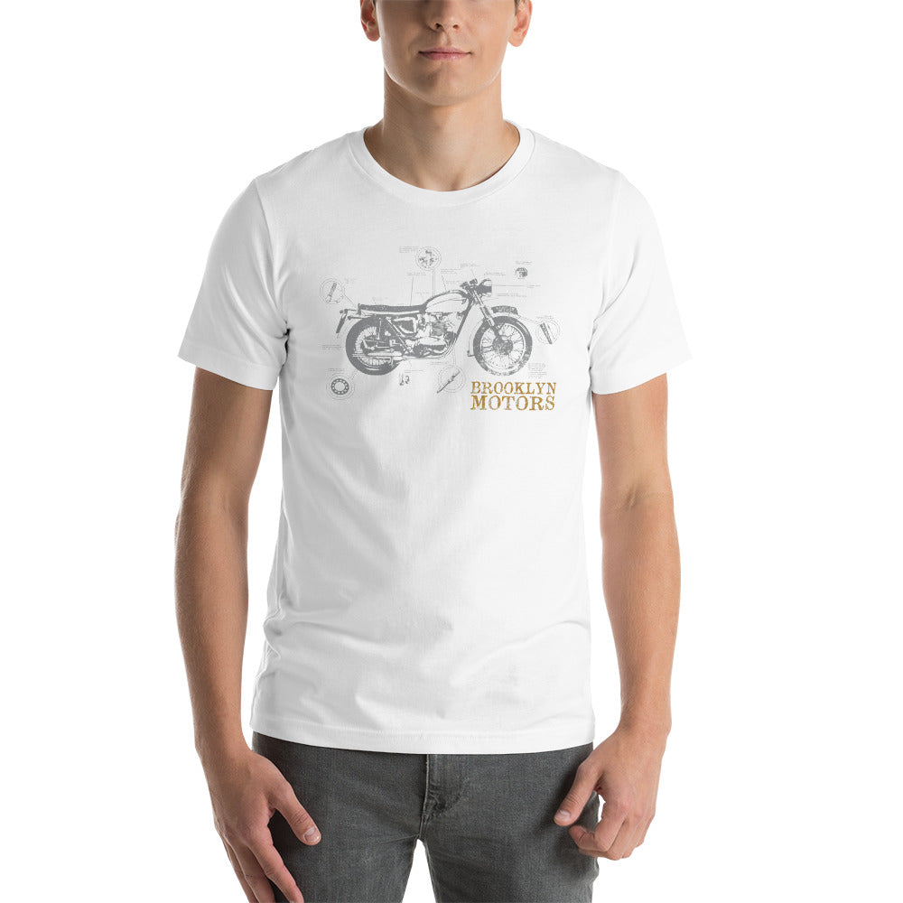
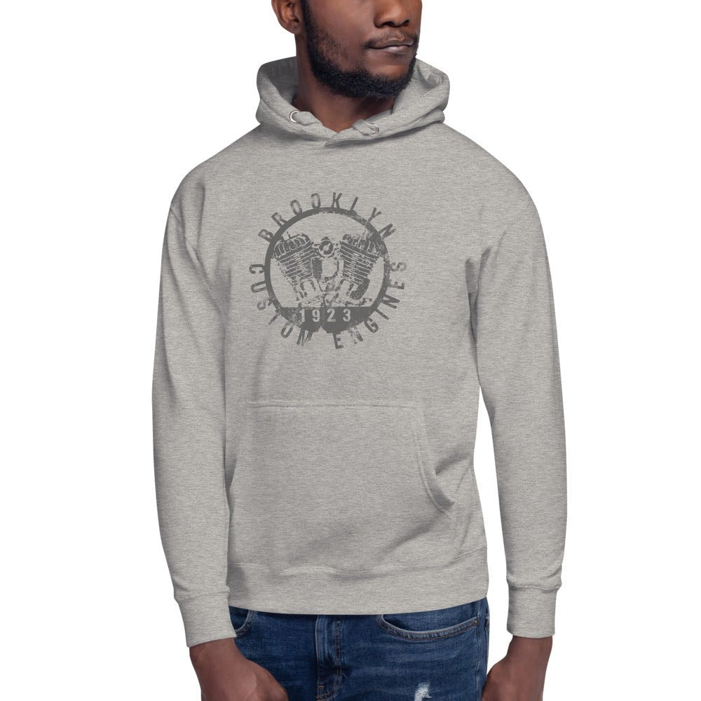
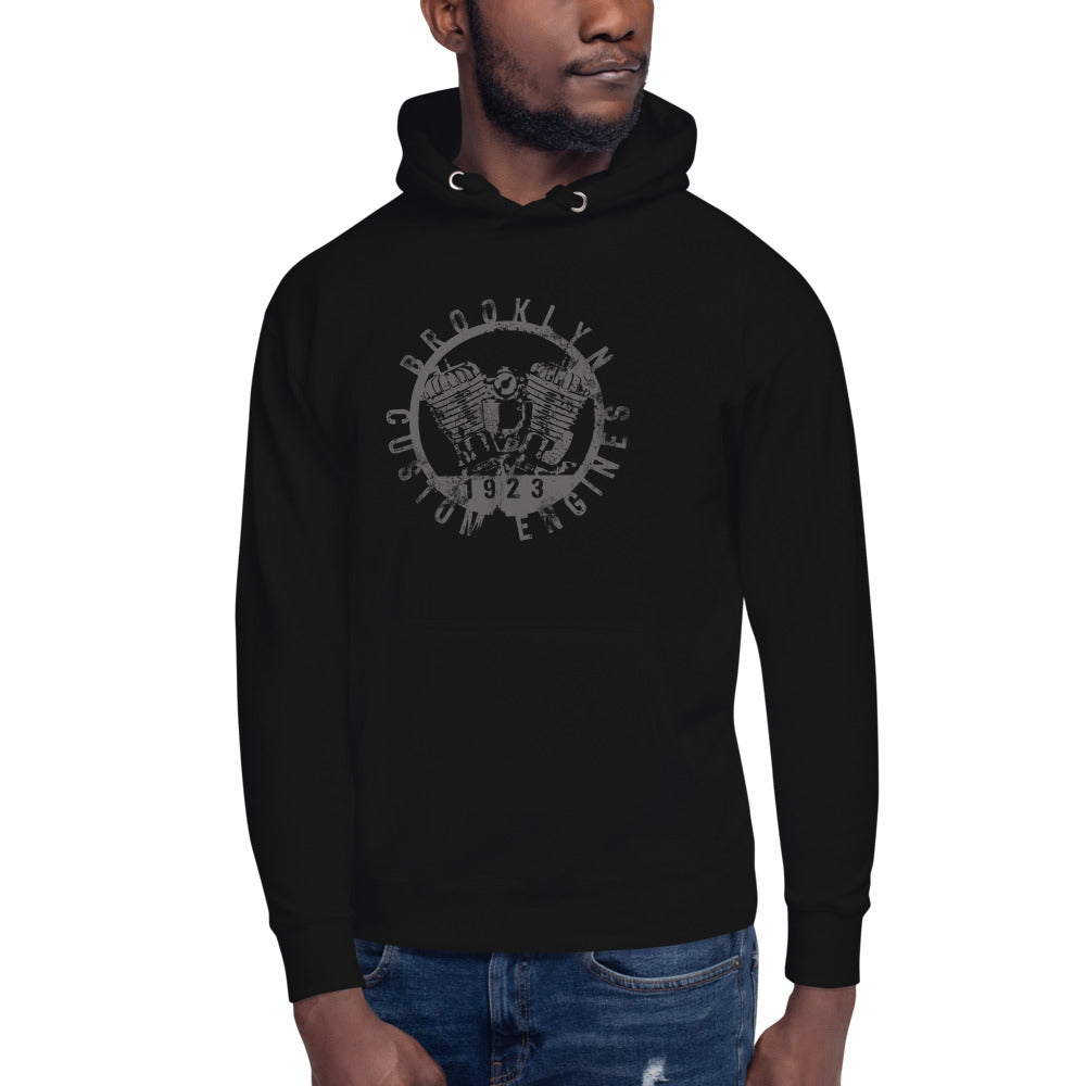
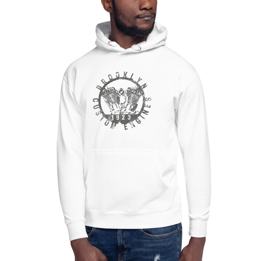
The Arrows Tee
The Arrows is BklynMotors' #1 seller — and if you look at the design, it's not hard to understand why.
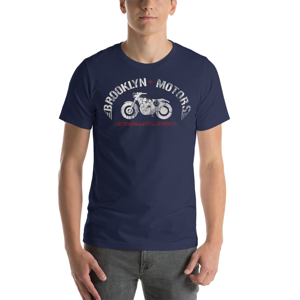
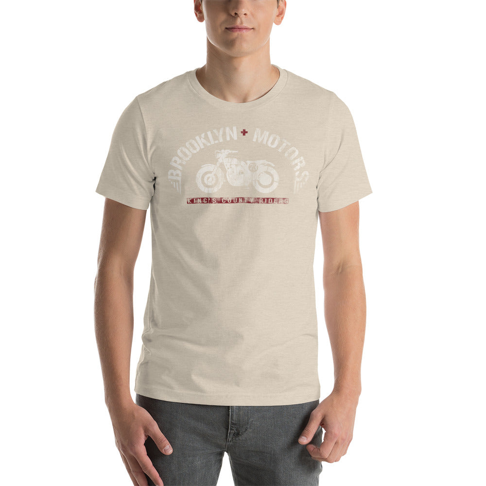
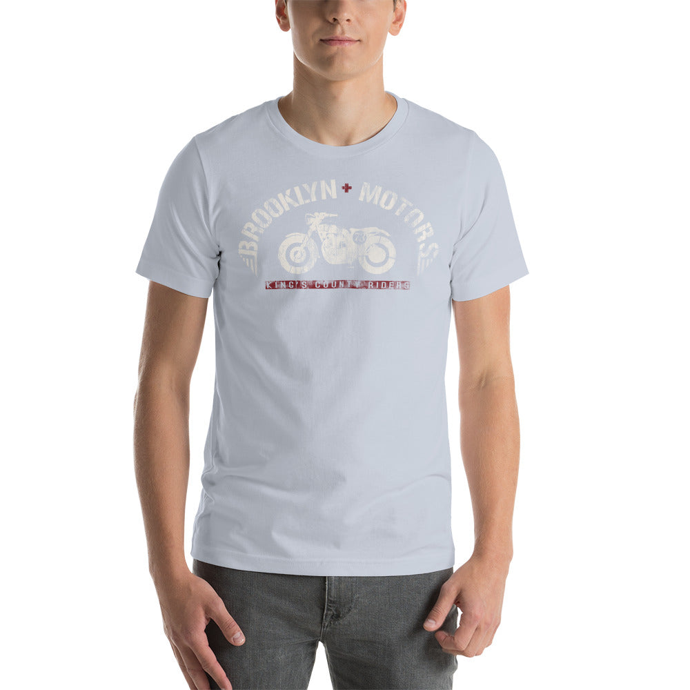
It's a motor club badge in the classic format: circular, centered, with a ribbon banner carrying the Brooklyn Motors name above and below a detailed chopper illustration. The color palette runs gold, black, and gray. The design sits right in that sweet spot between genuine vintage artifact and something you'd actually wear today.
There's no excess in it. Every element earns its place. That's the mark of design that was built to last — not designed to trend.
Why It Works Off the Bike
The graphic tees that go the distance aren't the ones that explain themselves. They work because the design is strong enough to carry the shirt without context.
You don't need to ride a motorcycle to wear a motor club tee. You don't need to know Brooklyn to respond to the design. What you're picking up on is craft — the fact that someone cared enough about the image to get it right.
That's always been the appeal of American graphic tees. Not the brand, not the story you have to be told — the thing you can see.
Vintage design works because it respects the person wearing it. It trusts them to get it.
Final Word
The cycle keeps going because the formula keeps working. Clean imagery. Honest materials. A design that doesn't need to explain itself.
That's what a great vintage graphic tee has always been. That's what the Arrows is.