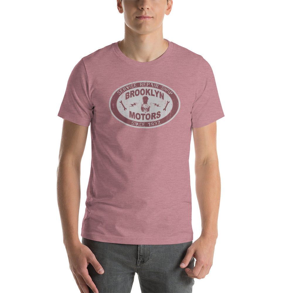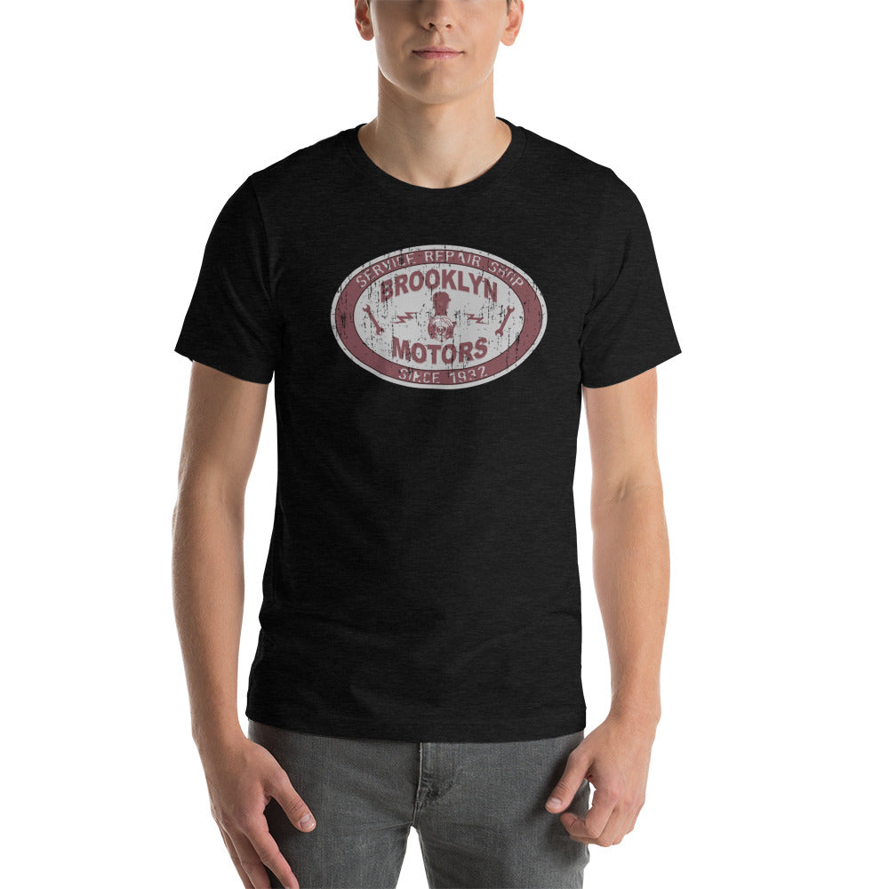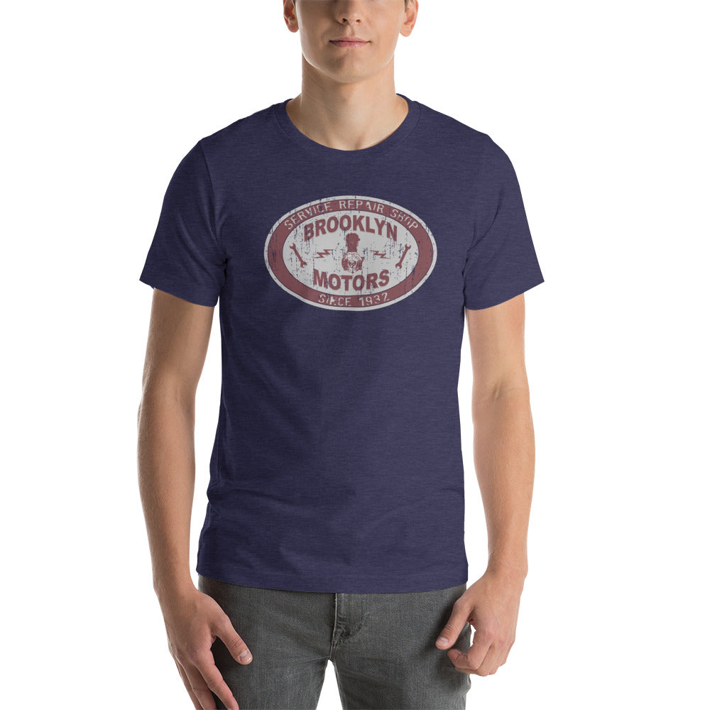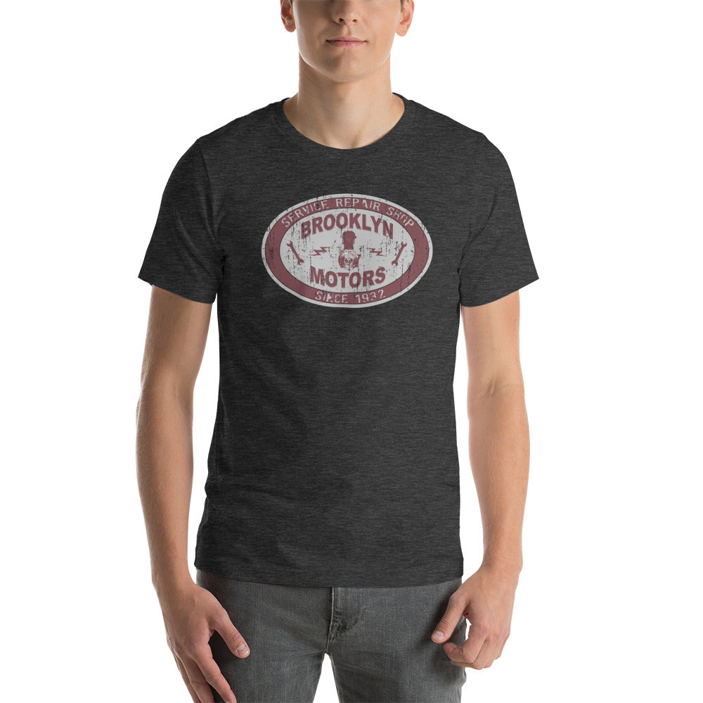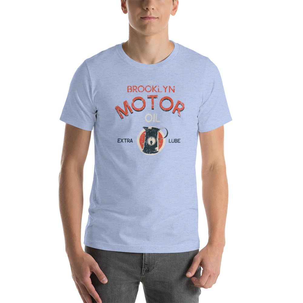
What Makes a Great Graphic Tee Great: A Real Buyer's Guide

Most people can identify a bad graphic tee in ten seconds. The print that cracks after three washes. The graphic that doesn't quite line up. The shirt that fits fine in the store and looks wrong everywhere else. The harder question is what separates a tee worth keeping for years from one that disappears from rotation by fall.
Here's what actually matters.
The Cotton Has to Be Right First
Everything starts with fabric. BklynMotors tees are printed on Airlume combed and ring-spun cotton. Both steps matter.
Combed cotton goes through an additional processing step that removes short fibers and straightens the remaining ones. The result: a finer, cleaner yarn with less pilling, better drape, and a softer feel that doesn't need washing to get there.
Ring-spun cotton is produced by continuously twisting and thinning the fibers during spinning. The thread is stronger, smoother, and holds its shape better than open-end spun alternatives. That's why ring-spun tees feel more substantial without being heavier.
The combination — combed and ring-spun — is what gives a quality graphic tee its hand feel. If a tee feels cheap before you've worn it once, no graphic is going to save it.
The Print Has to Hold
Direct-to-garment printing has improved significantly, but not all DTG is equal. The variables that matter: ink saturation, cure temperature, pre-treatment application, and how the graphic was designed in the first place.
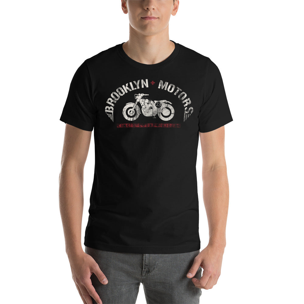
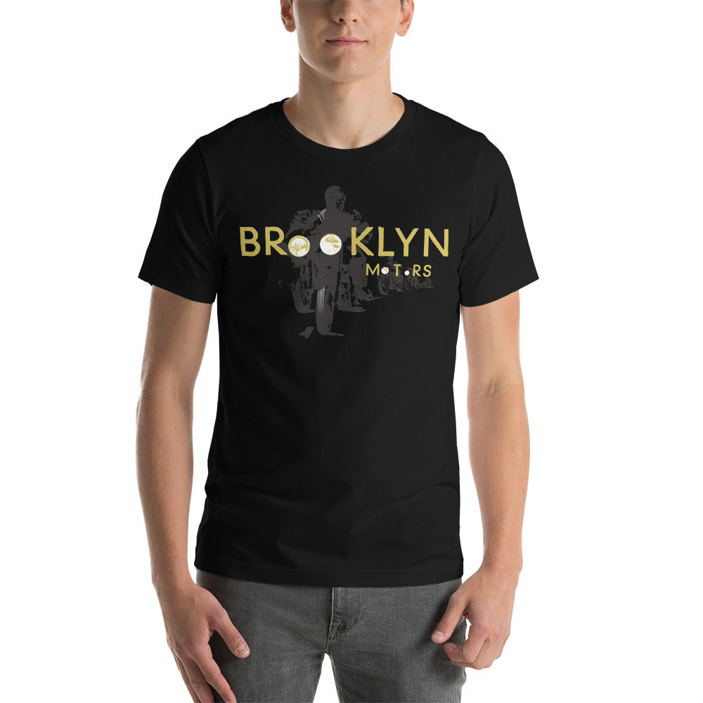
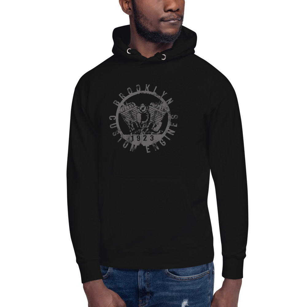
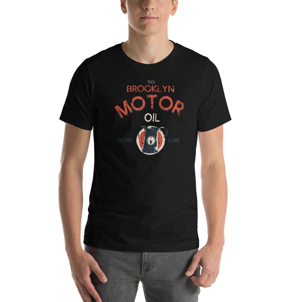
High-contrast designs on a dark base — like the Flatbush Fighters or the King of Spades — require proper pre-treatment of the fabric before printing. Without it, the white ink that underlays colored graphics on dark tees fades unevenly and the design loses definition after the first few washes.
The test: wash the tee inside out in cold water, hang dry. If the print holds its definition through ten washes, the technique is solid. If it starts cracking at wash three, the cure was wrong.
The Graphic Has to Actually Mean Something
This is where most graphic tees fail. A logo isn't a graphic. A brand name isn't a design. What separates a tee worth wearing from one that ends up at the back of the drawer is whether the graphic holds up to a second look.
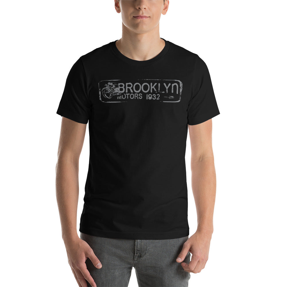
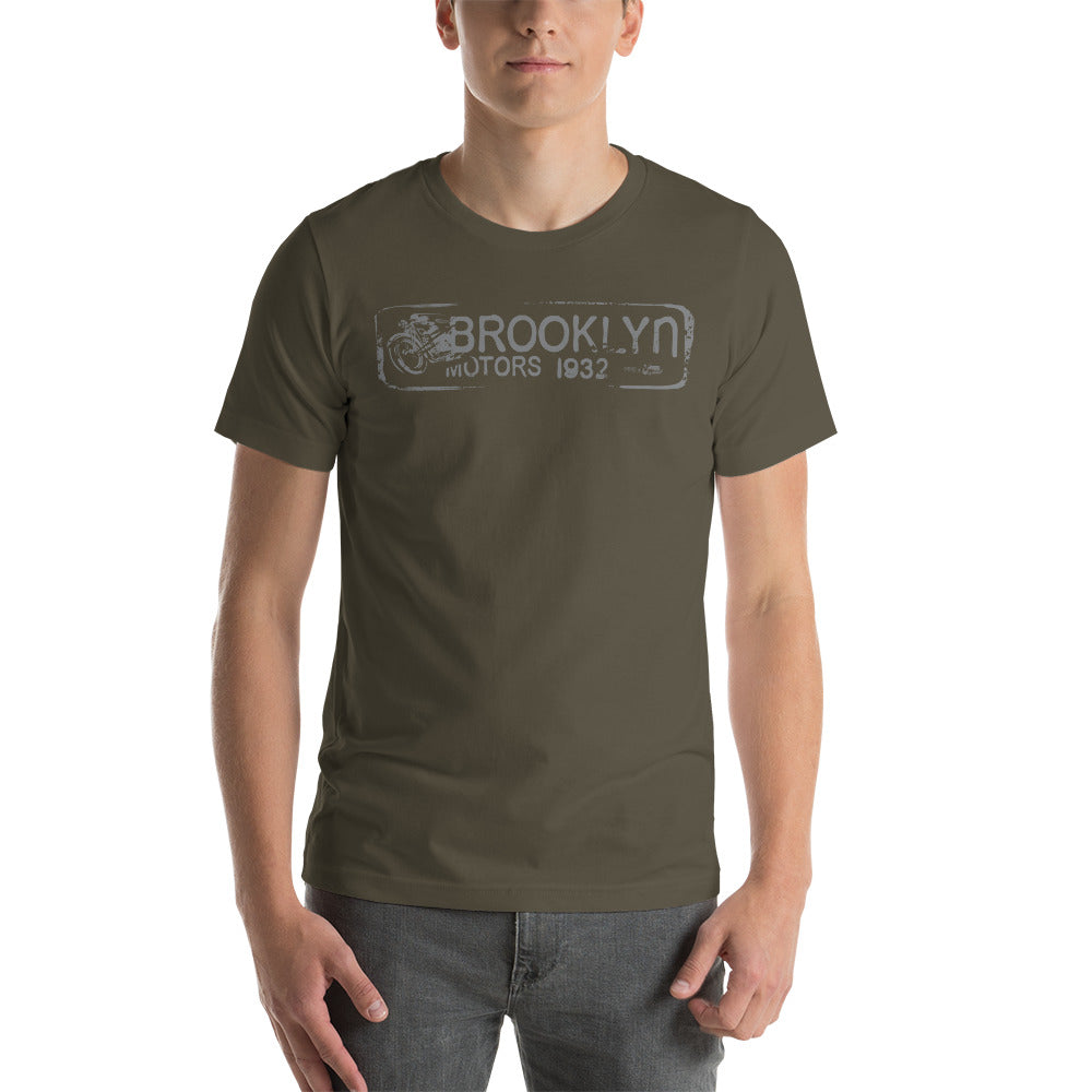
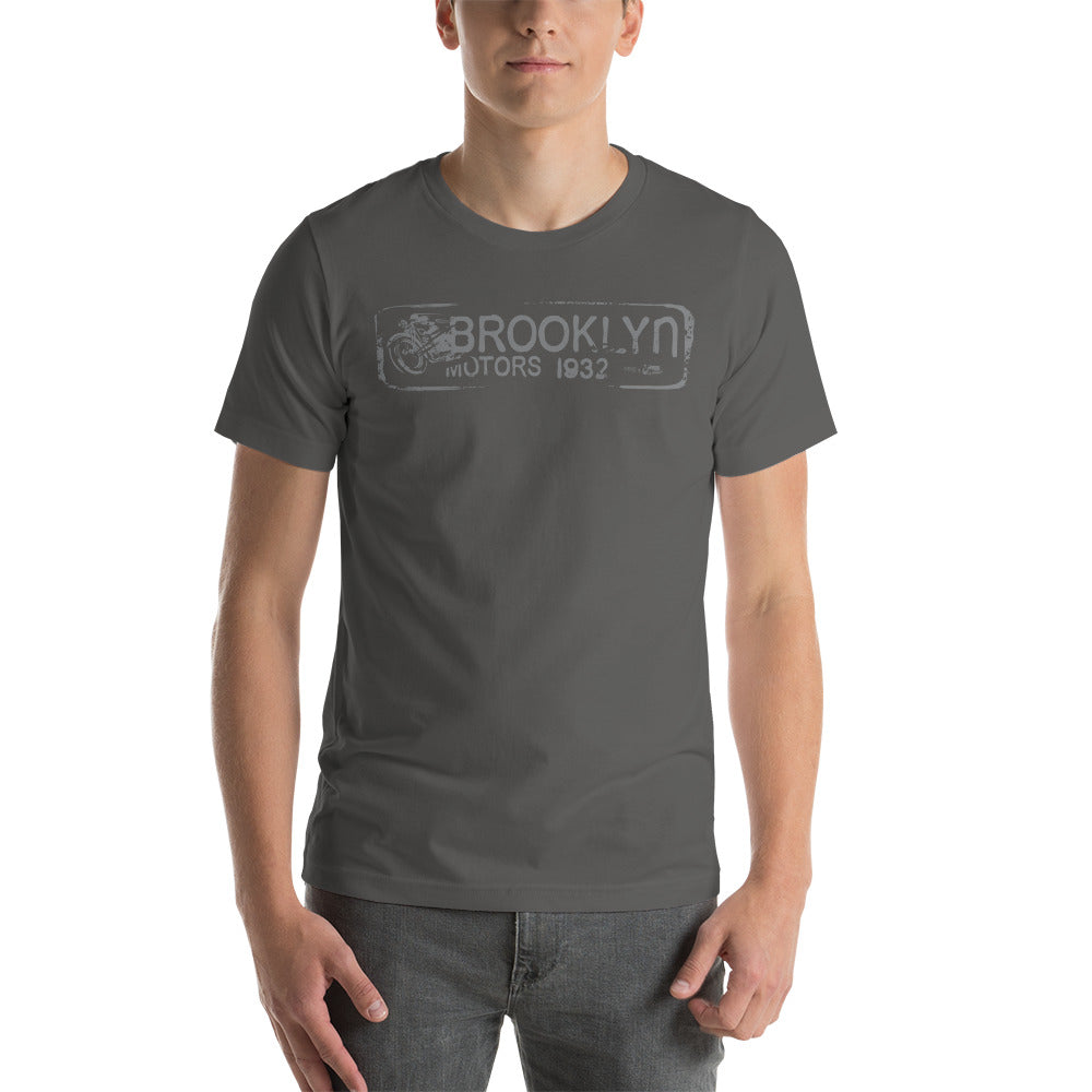
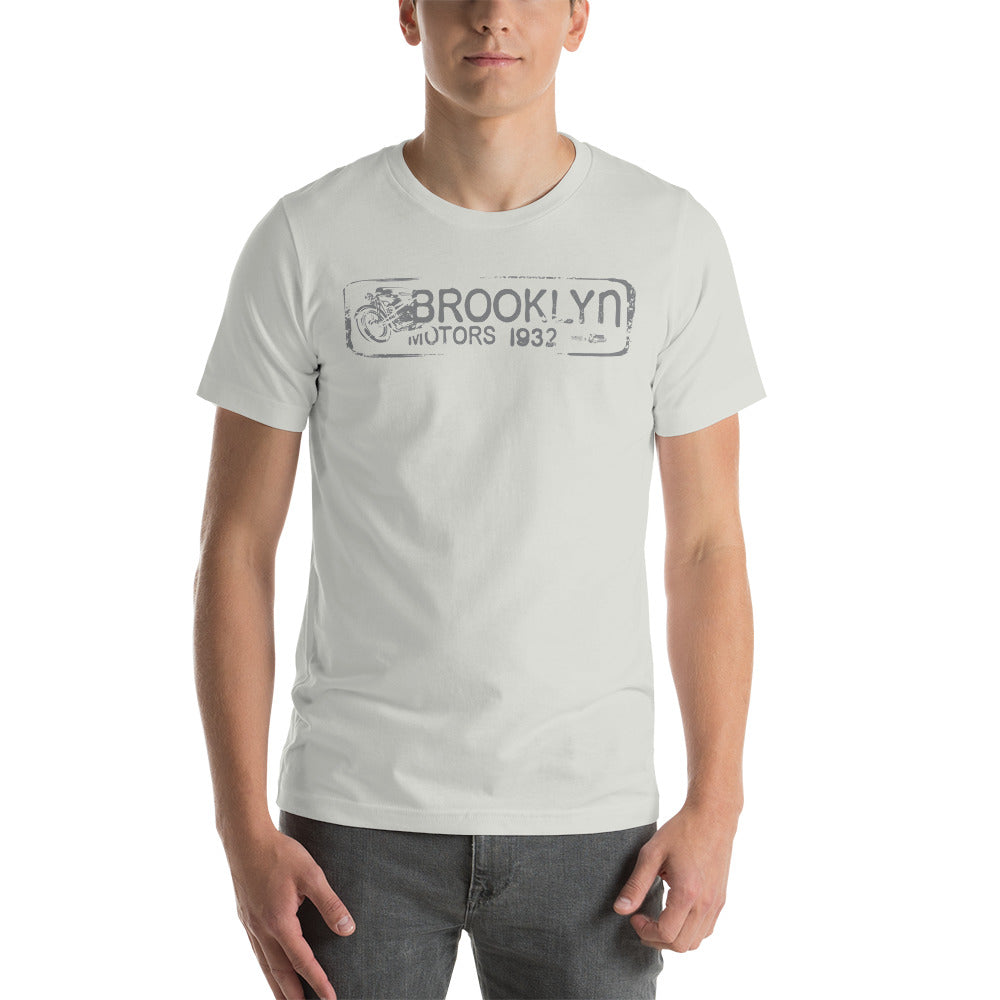
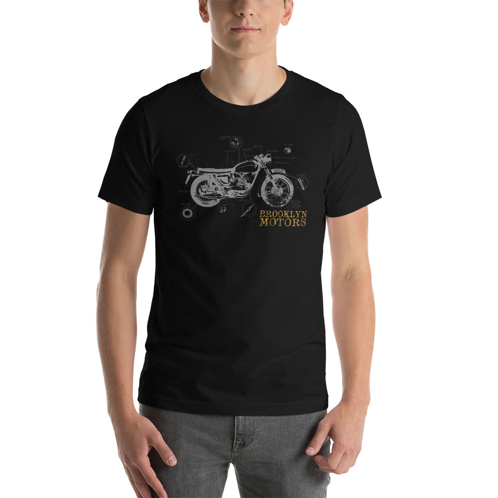
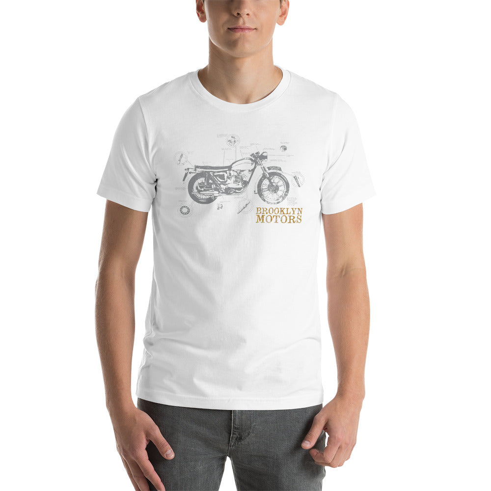
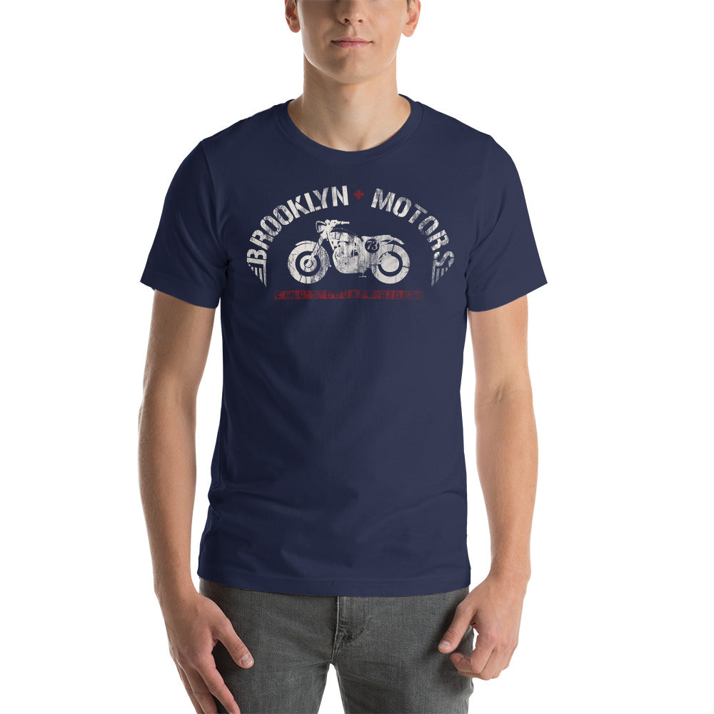
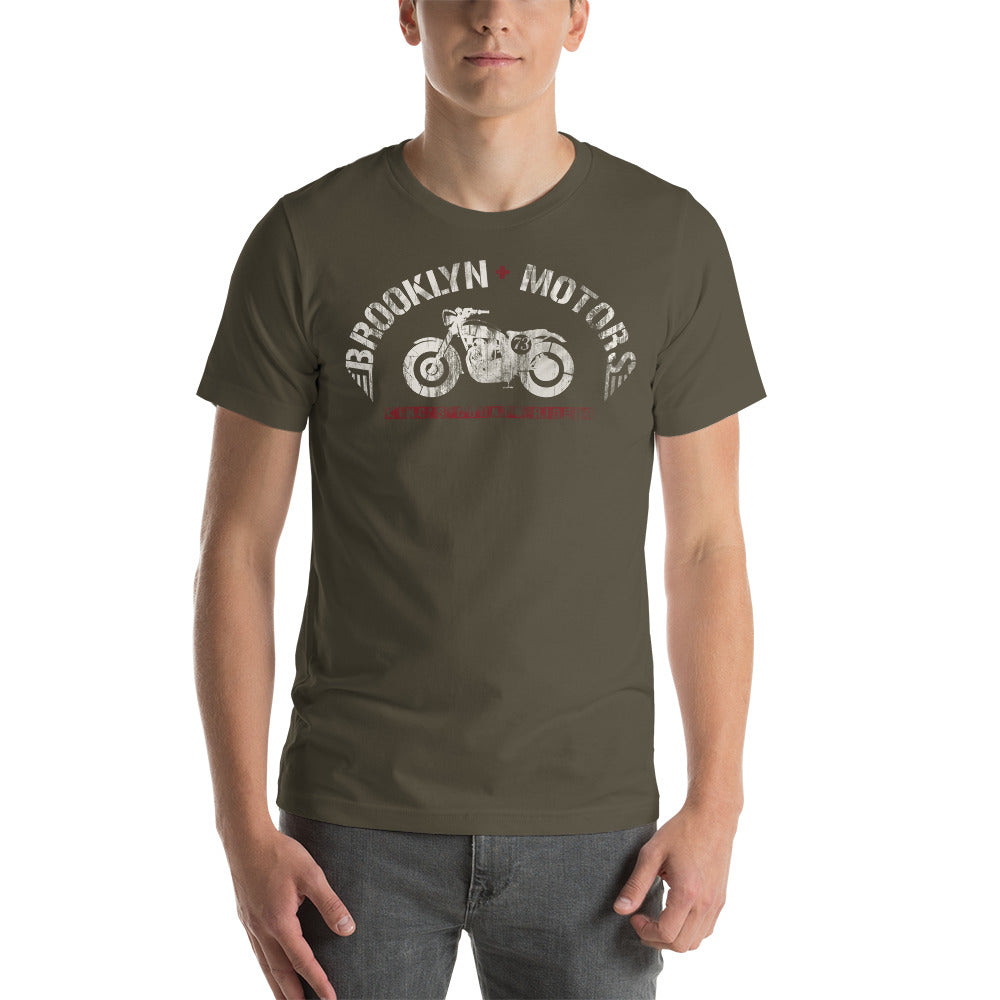
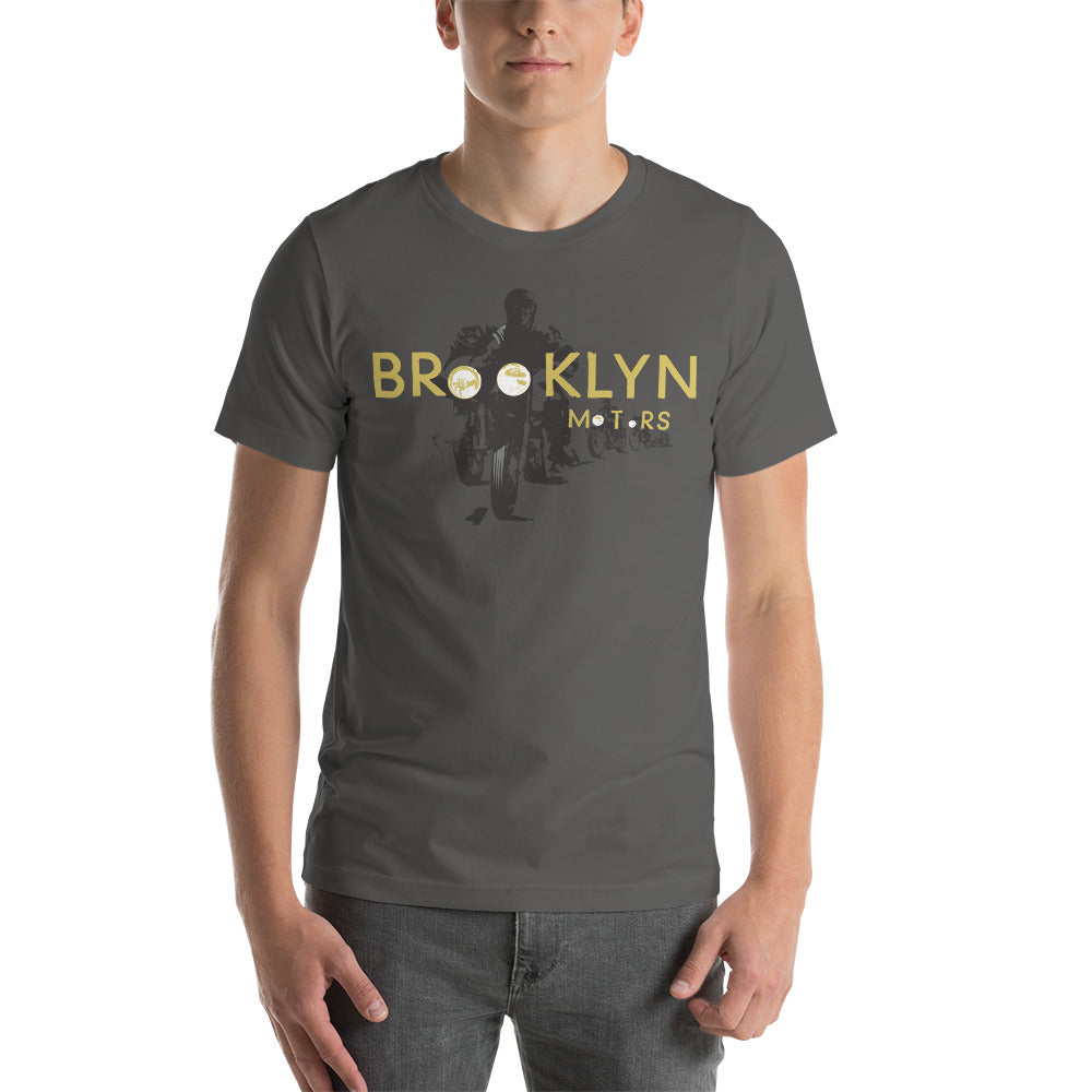
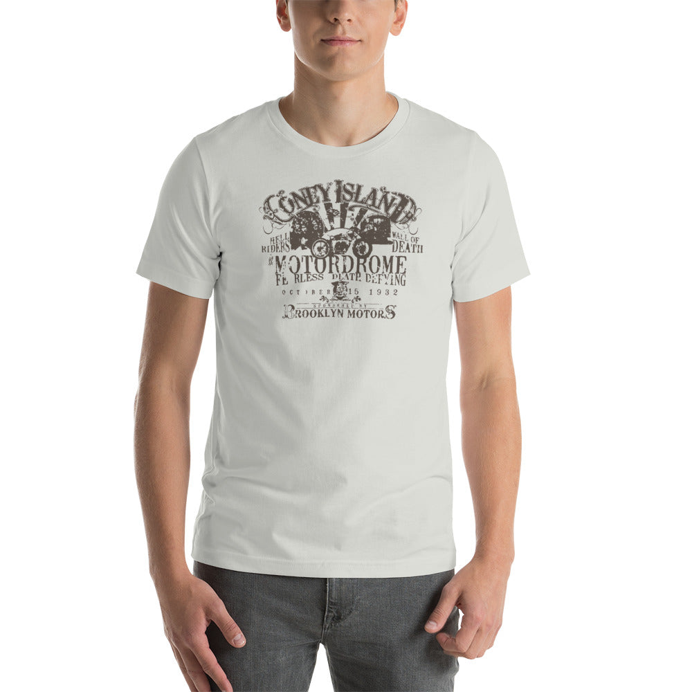
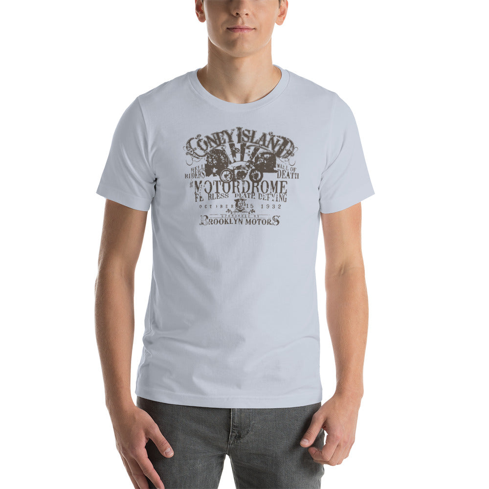
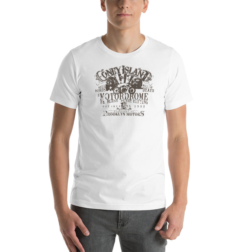
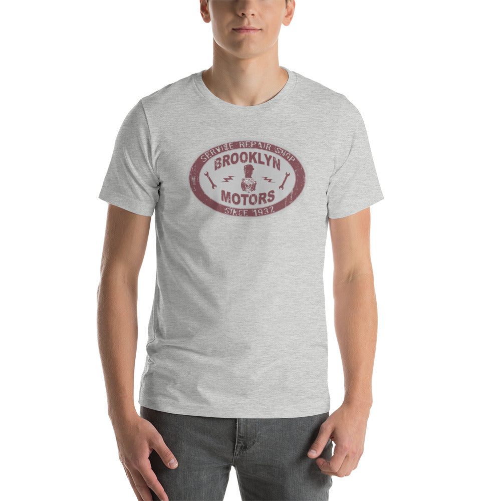
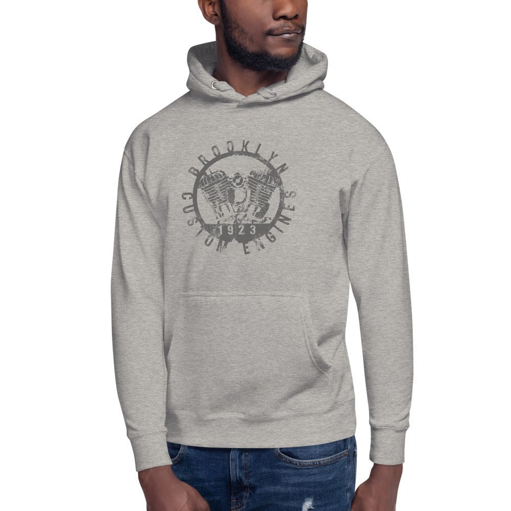
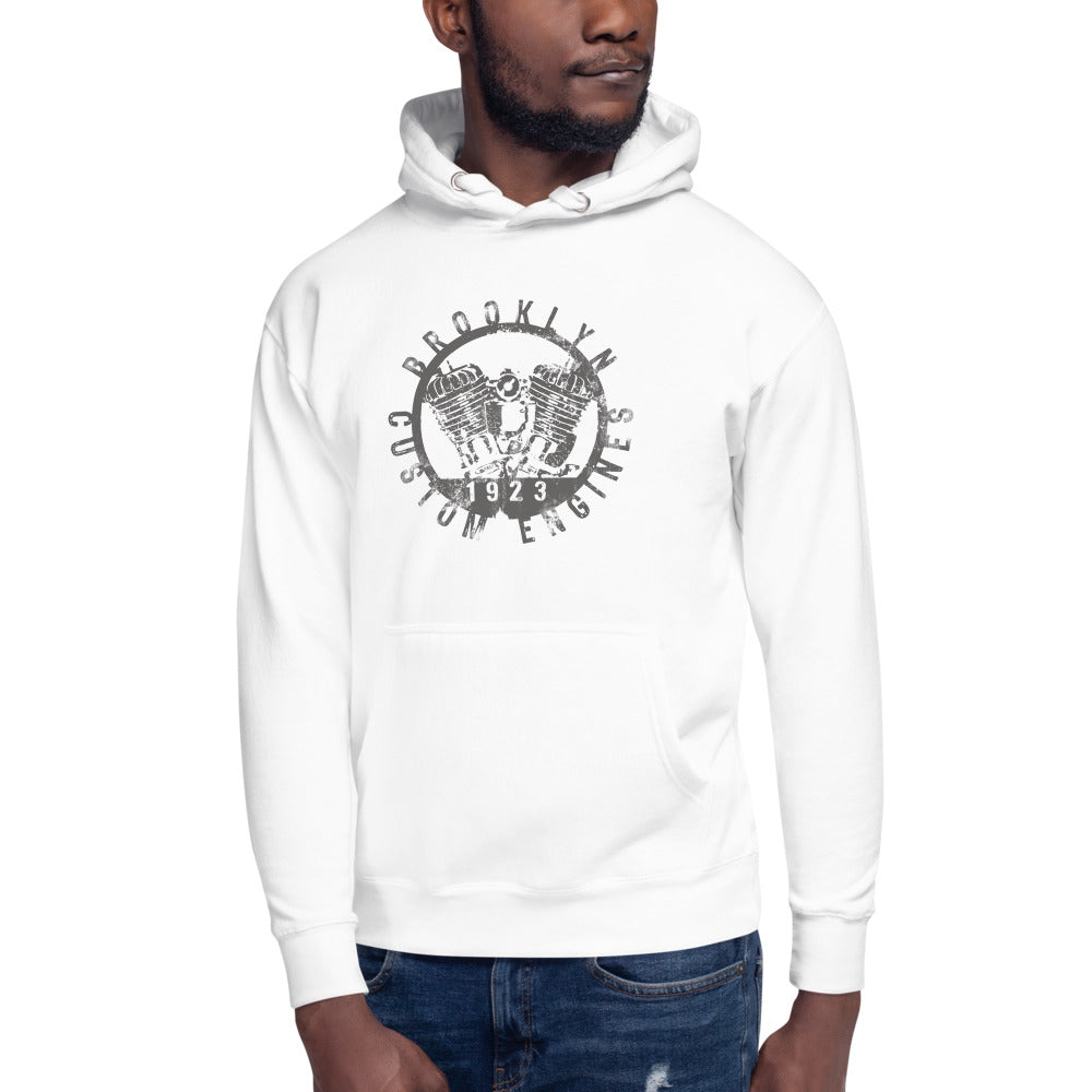
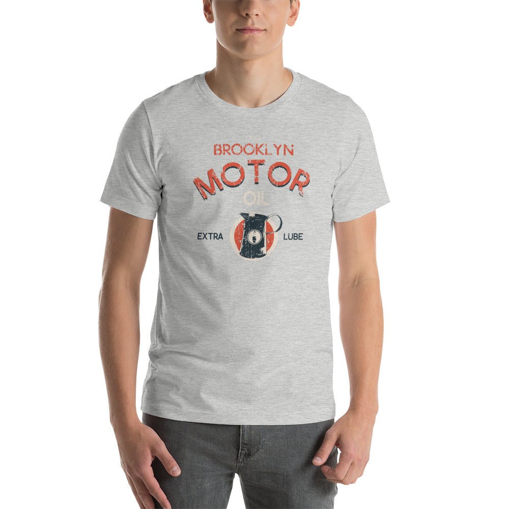
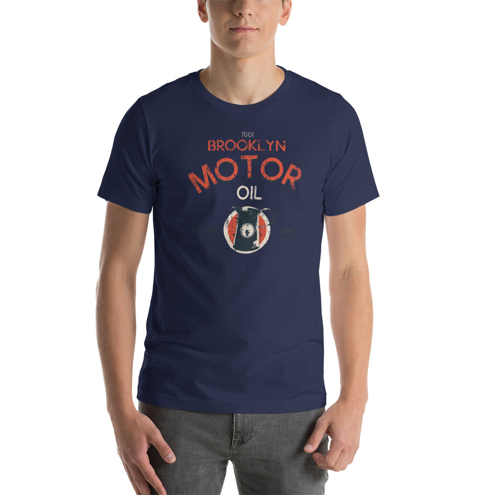
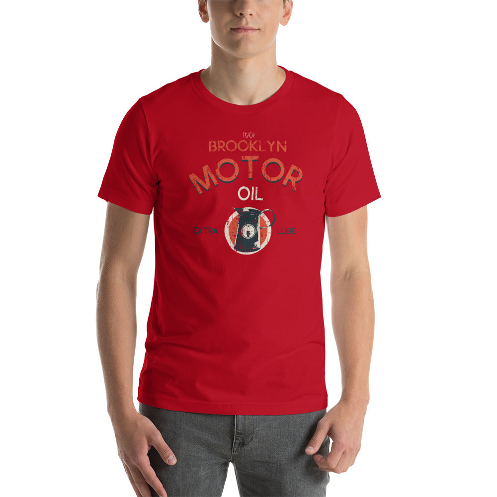
The BklynMotors design language pulls from American motorcycle club graphics developed between the 1940s and 1970s. The format: a strong central image, bold typography in the slab serif and block letter tradition, high contrast, and a worn-in quality that signals the garment has been somewhere.
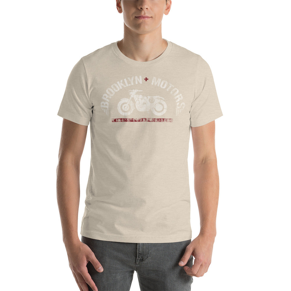
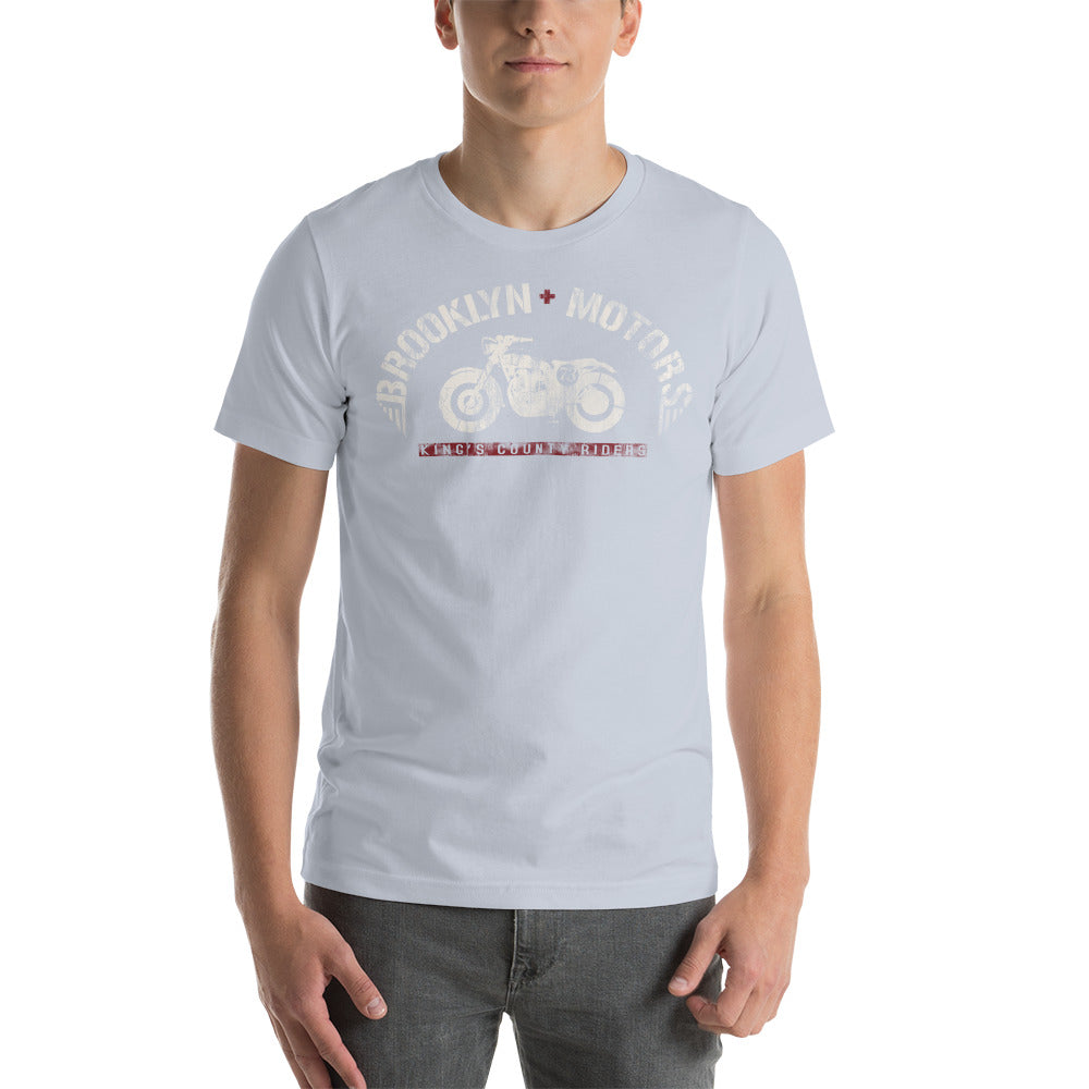
The Kings County Riders V2 is a good example. The graphic layers type, imagery, and distressed texture in a way that rewards attention. It doesn't look the same after a glance as it does after a minute. That's the difference between a design and a logo slapped on cotton.
The Fit Has to Work
A great graphic on a badly cut tee is still a badly cut tee. The BklynMotors premium fit is designed to sit at the hip, end near mid-bicep on the sleeve, and lie flat across the chest so the graphic reads correctly. The chest graphic should never pull or bunch — if it does, size up.
For most people: if you're between sizes, size down on the BklynMotors lineup. The vintage-inspired cuts run slightly relaxed by design.
The Result
A graphic tee that holds up over time is the intersection of four things: fabric quality, print durability, a graphic with real design intent, and a cut that works on an actual body. Most mass-market tees get maybe two of those right.
The BklynMotors lineup was built around all four. That's not a marketing claim. It's why the tees hold their definition after years of wear, and why people who buy one tend to come back for another.