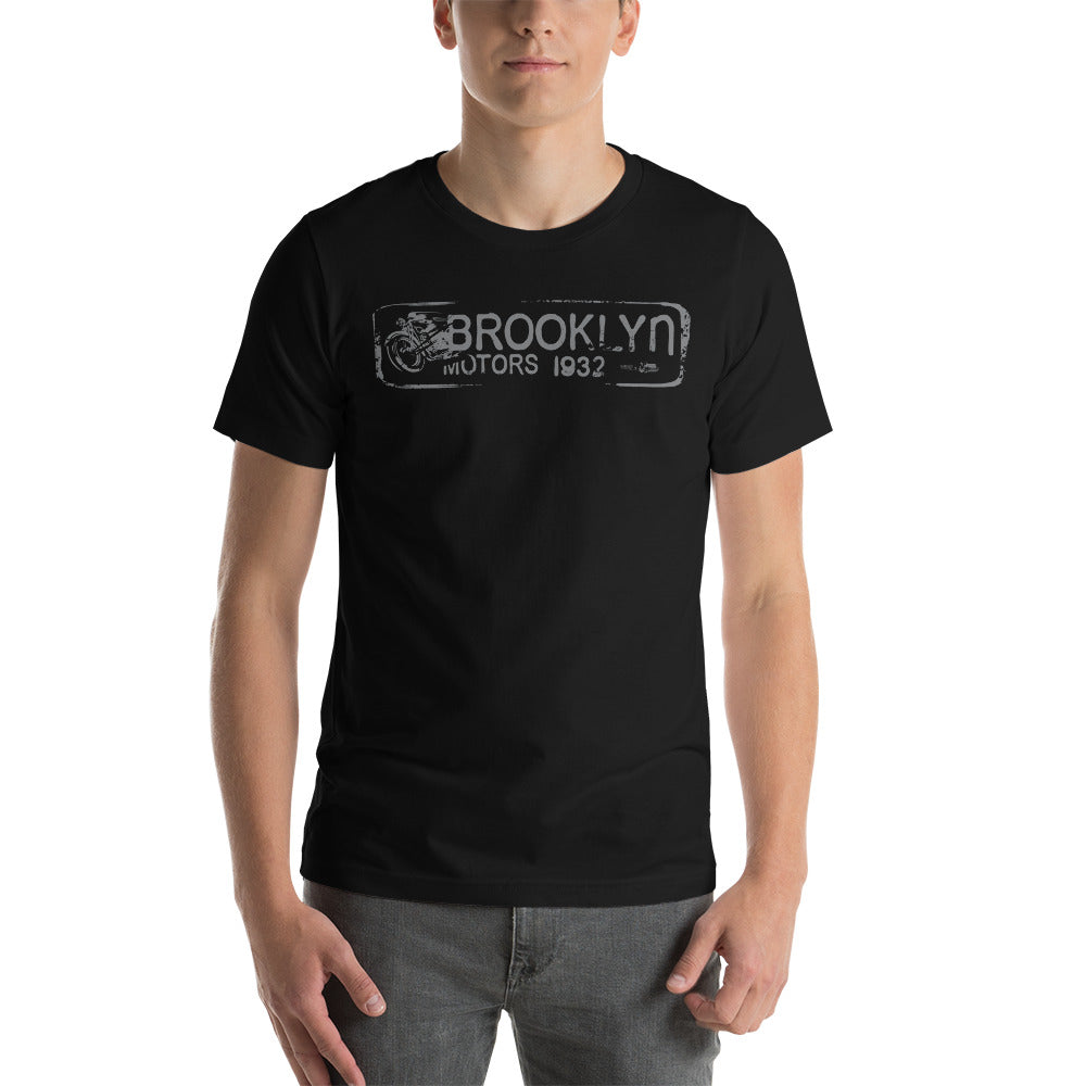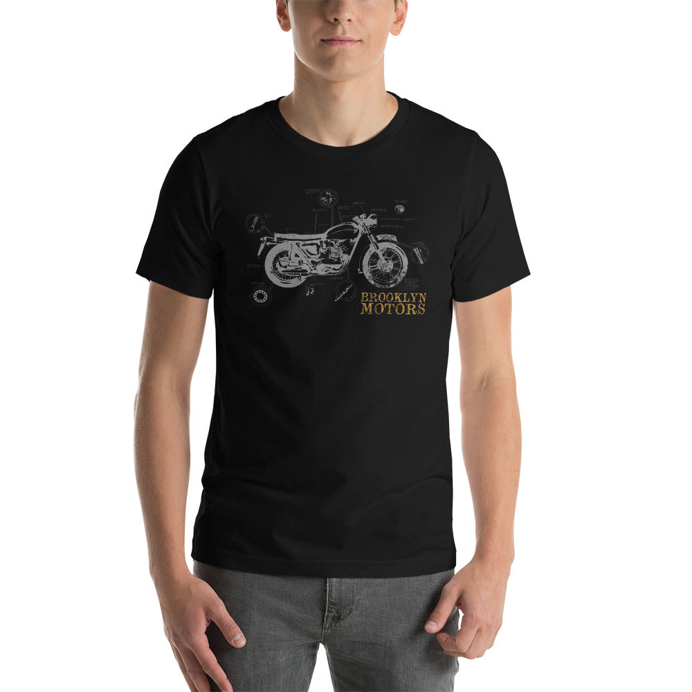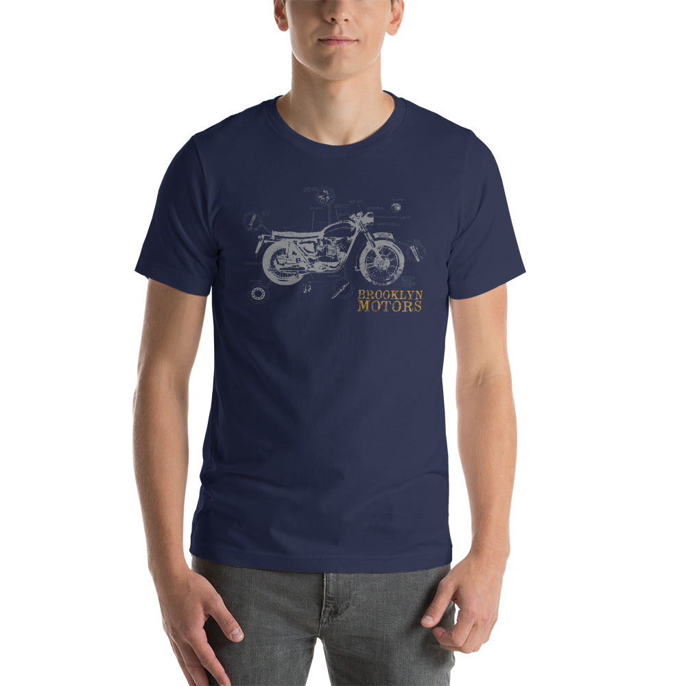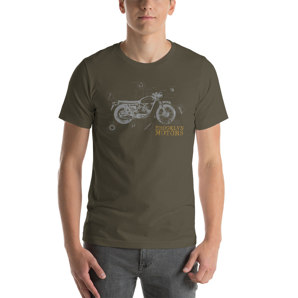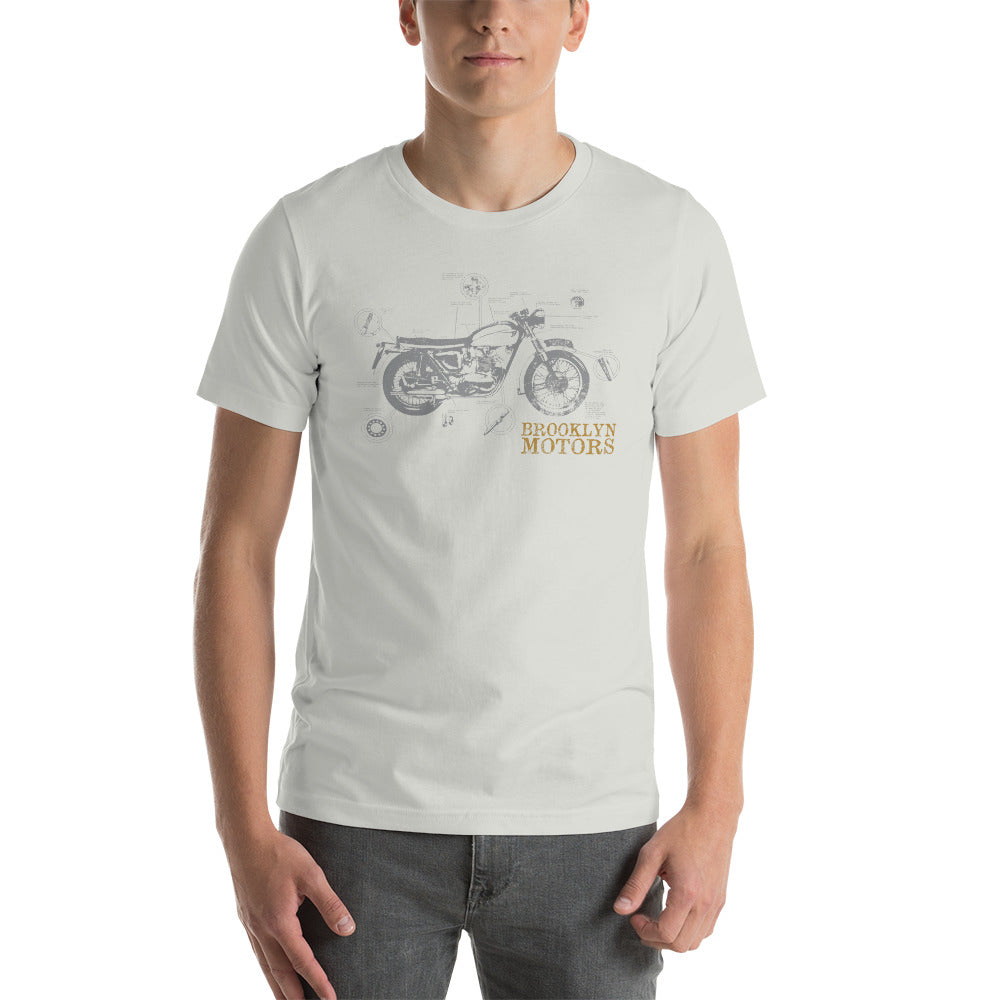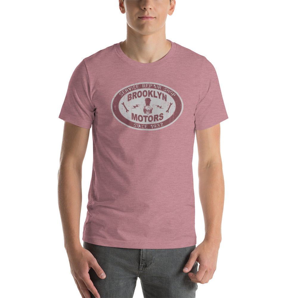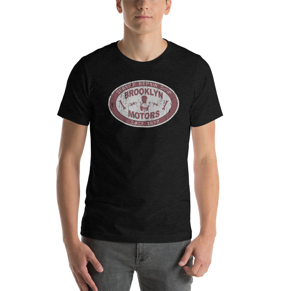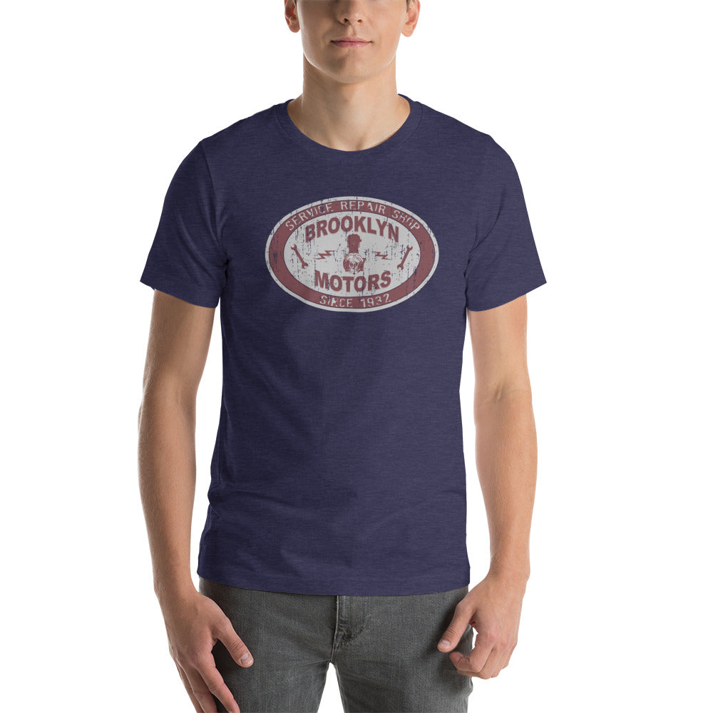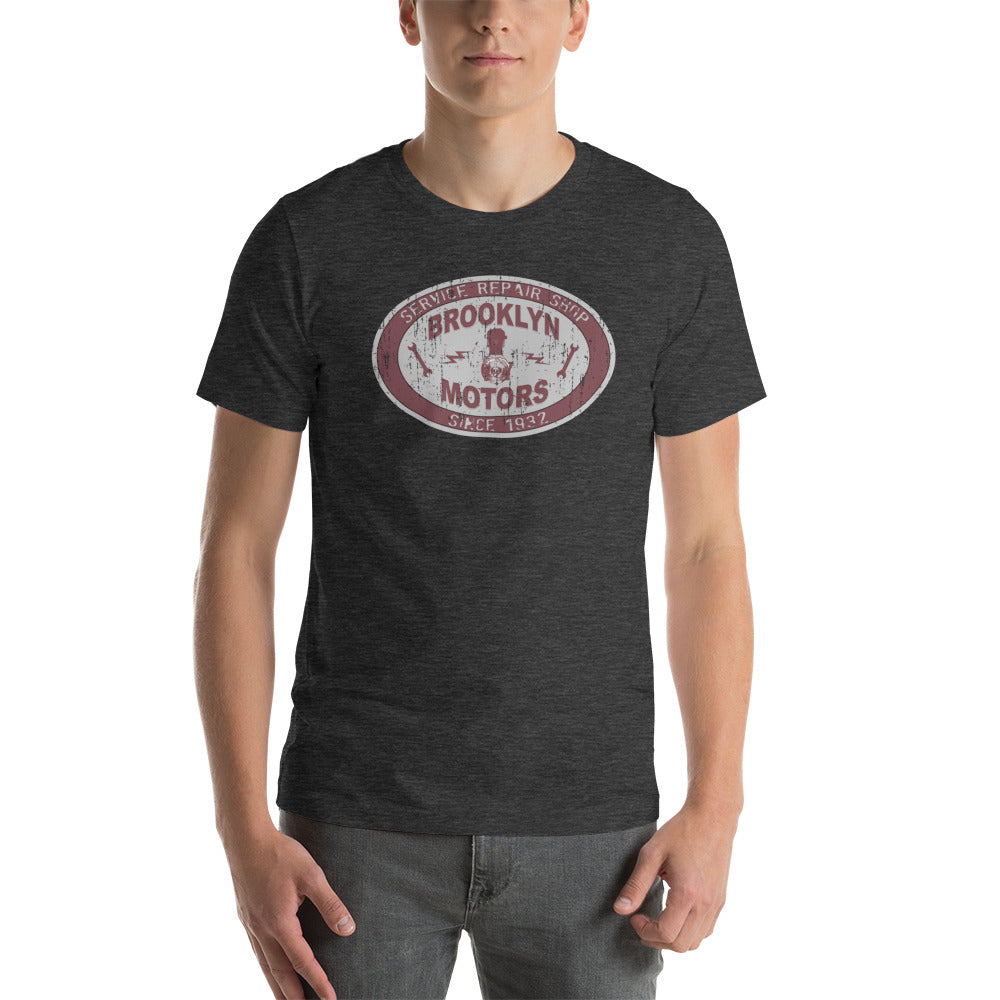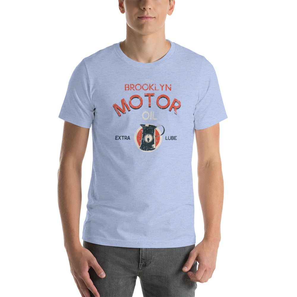
The Graphic Tee as a Statement: When the Design Does the Talking

Most graphic tees are just loud. A logo, a slogan, a licensed image pressed onto cotton and sold as a personality. The result is a shirt that communicates nothing except brand awareness for someone else.
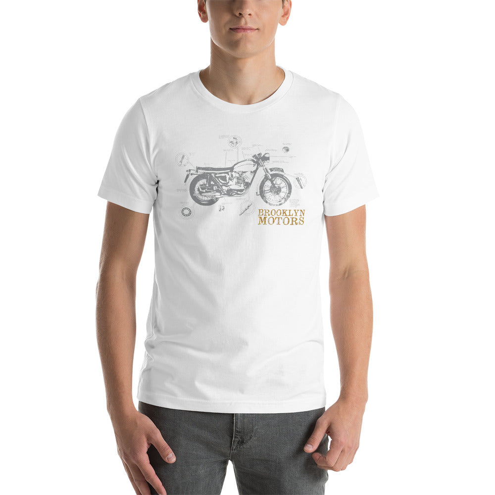
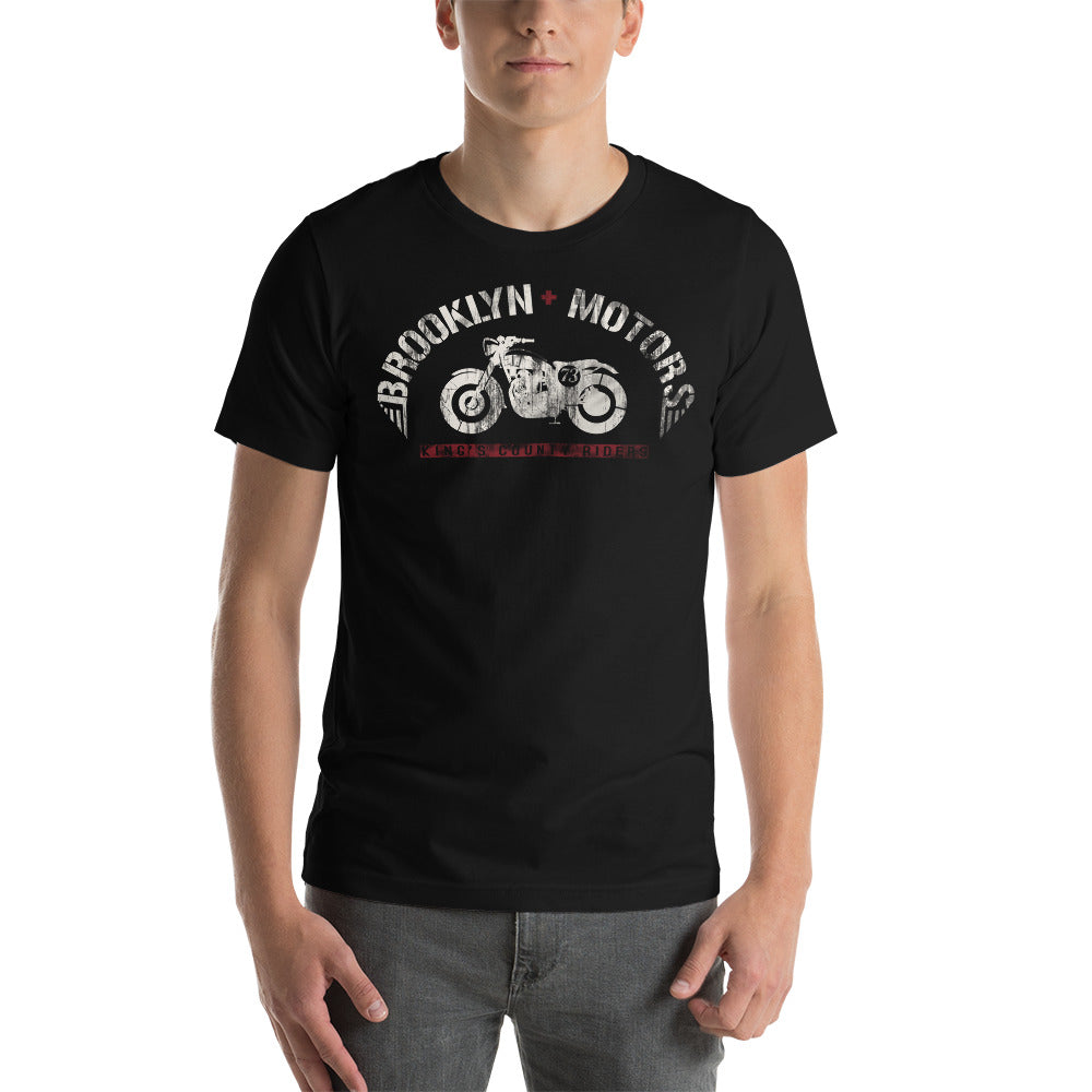
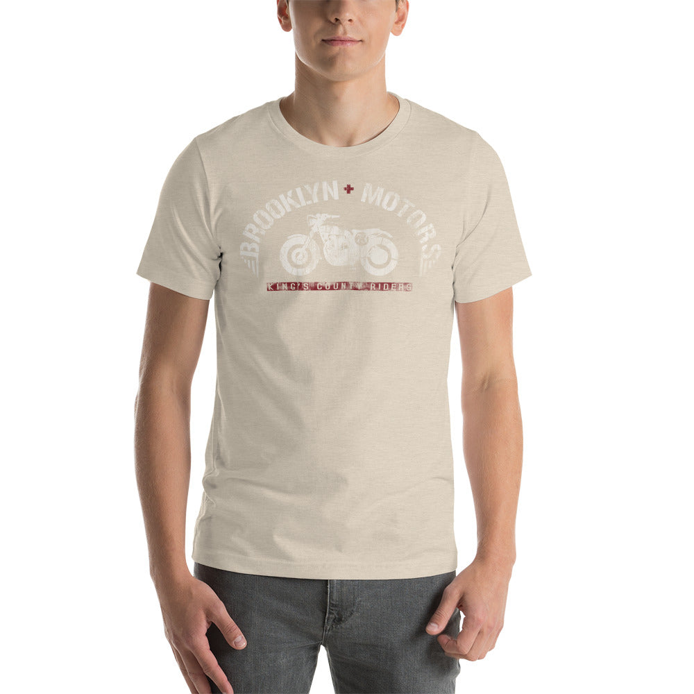
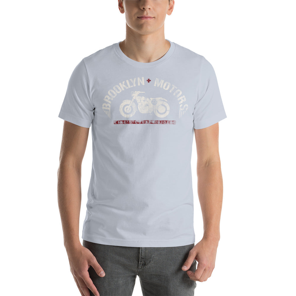
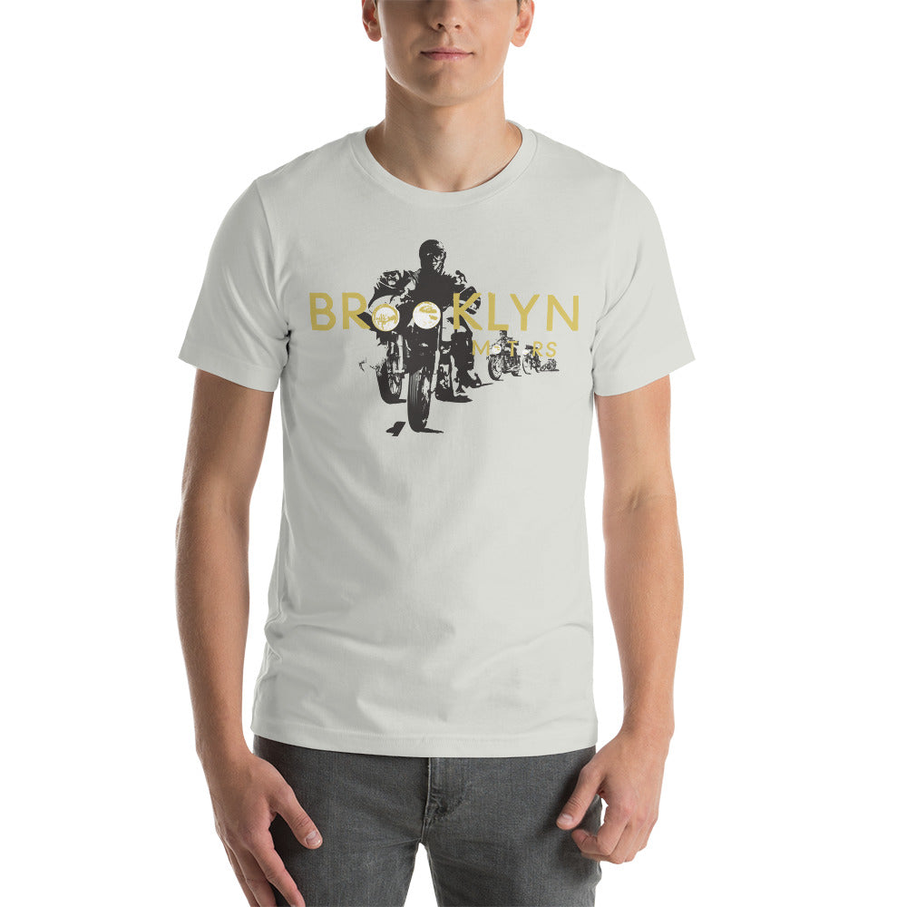
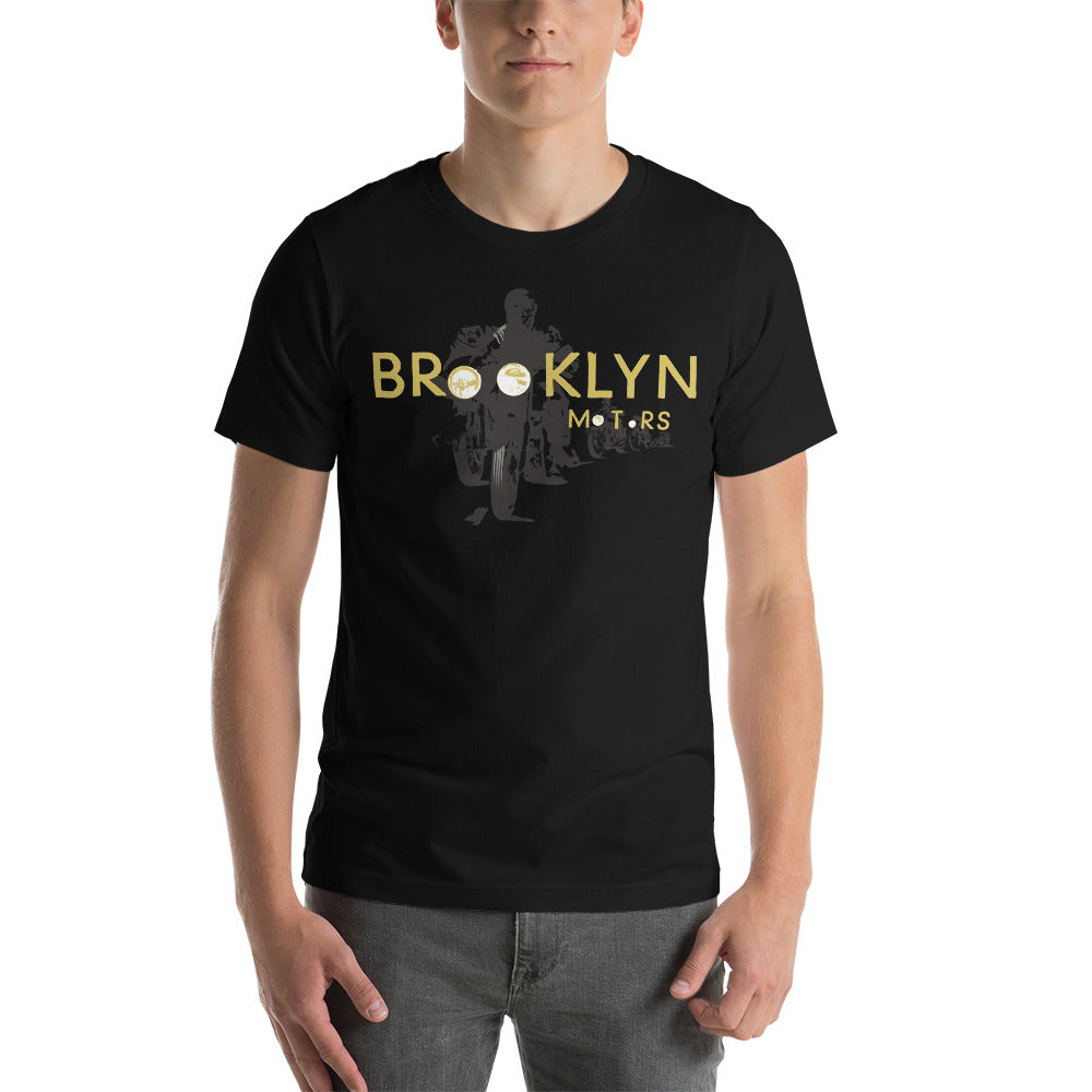
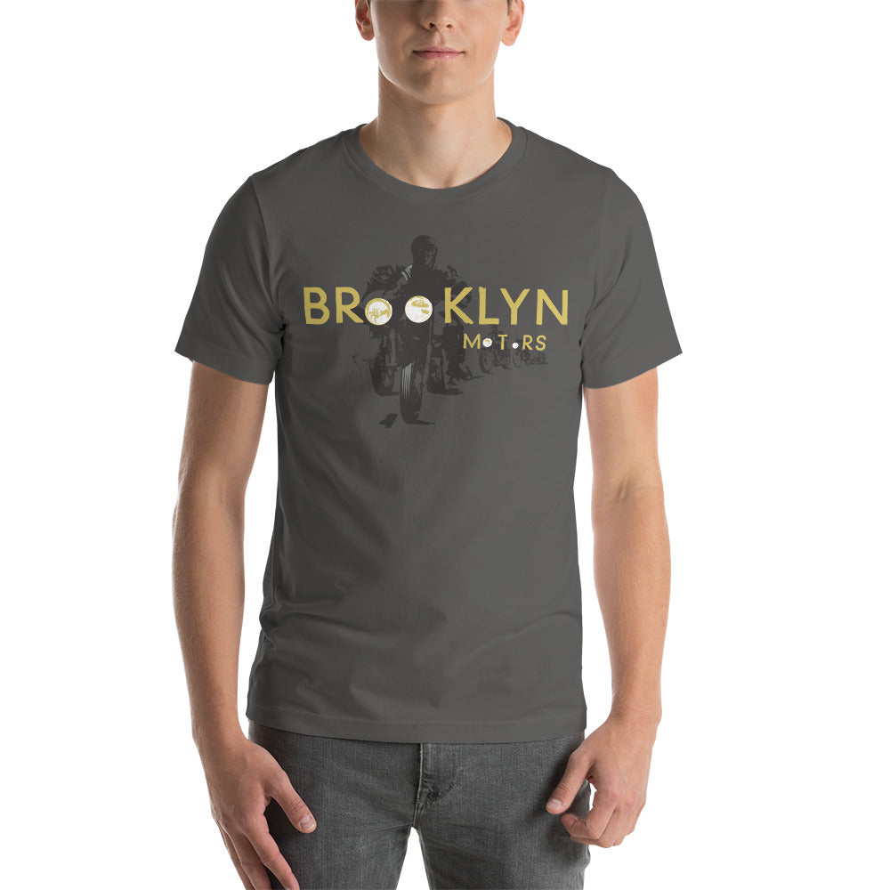
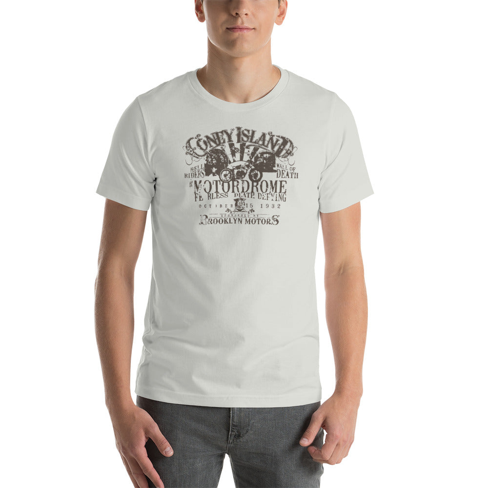
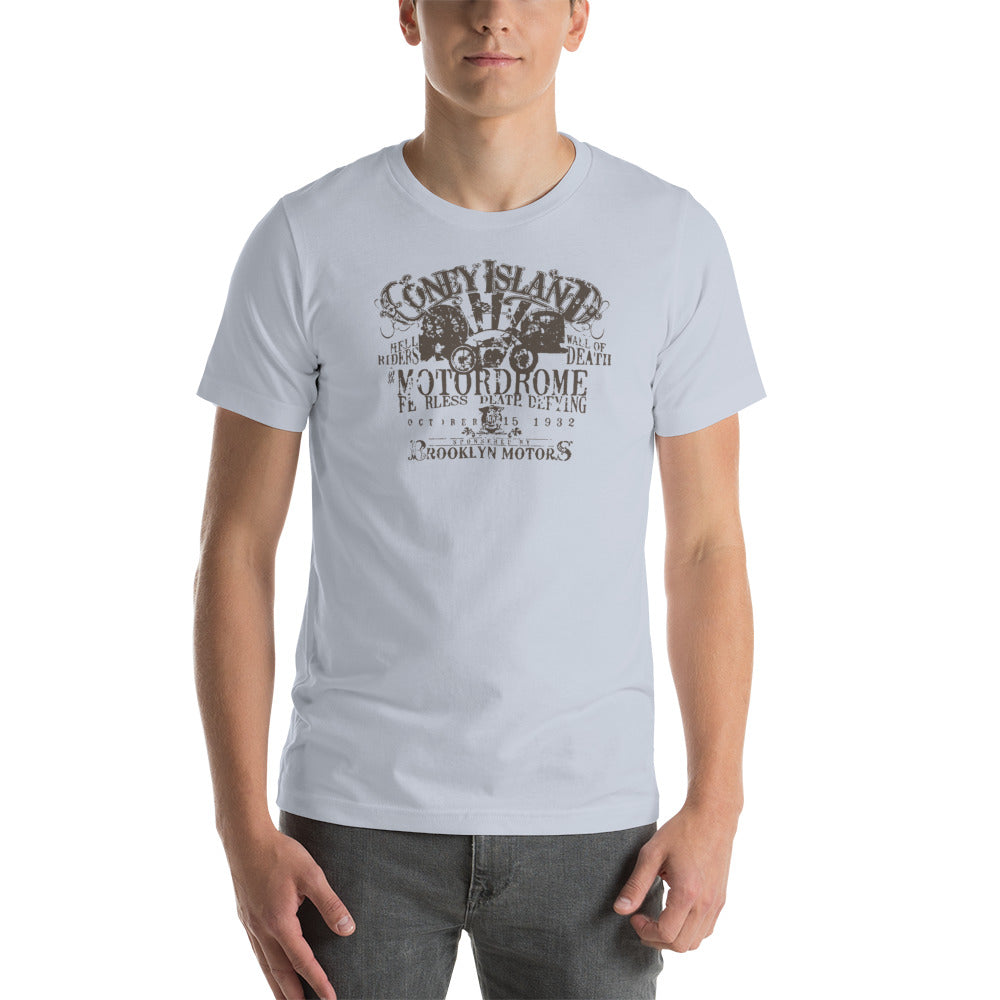
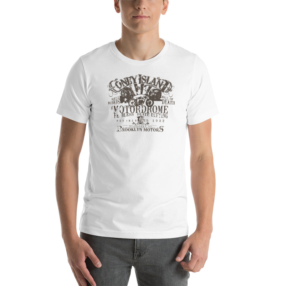
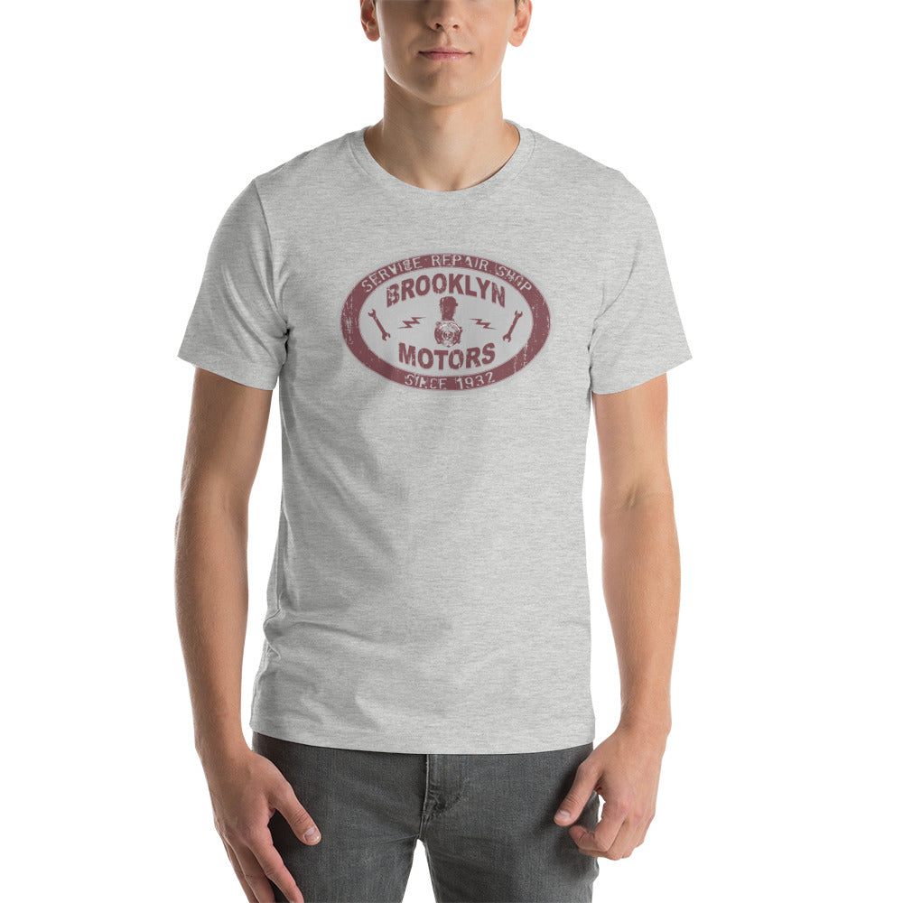
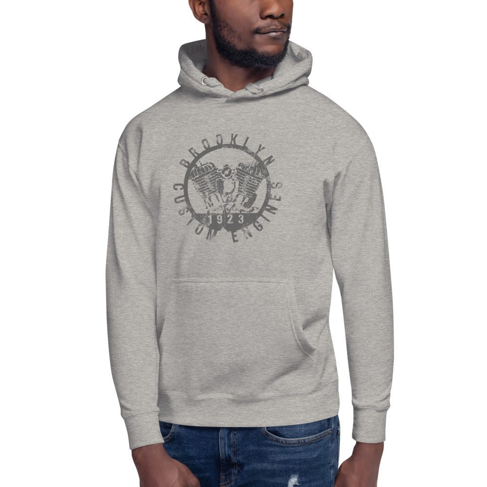
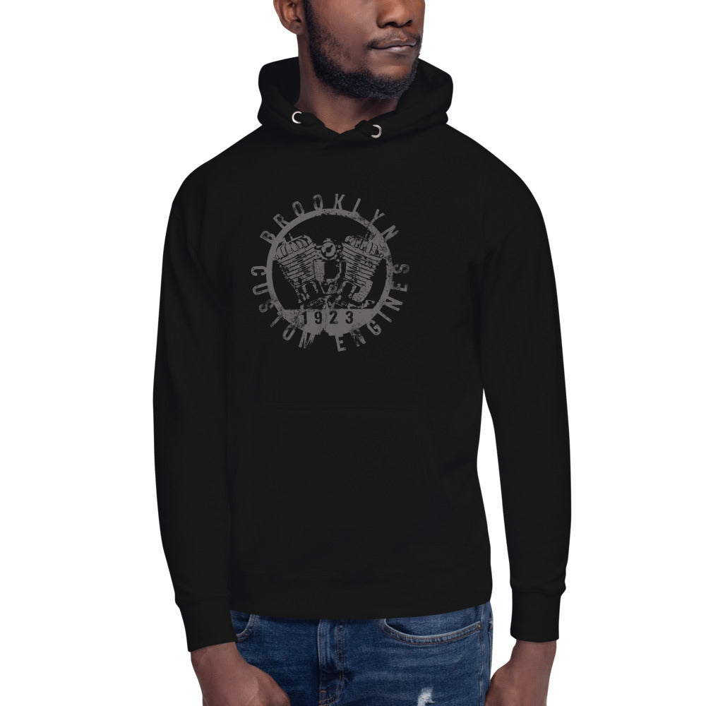
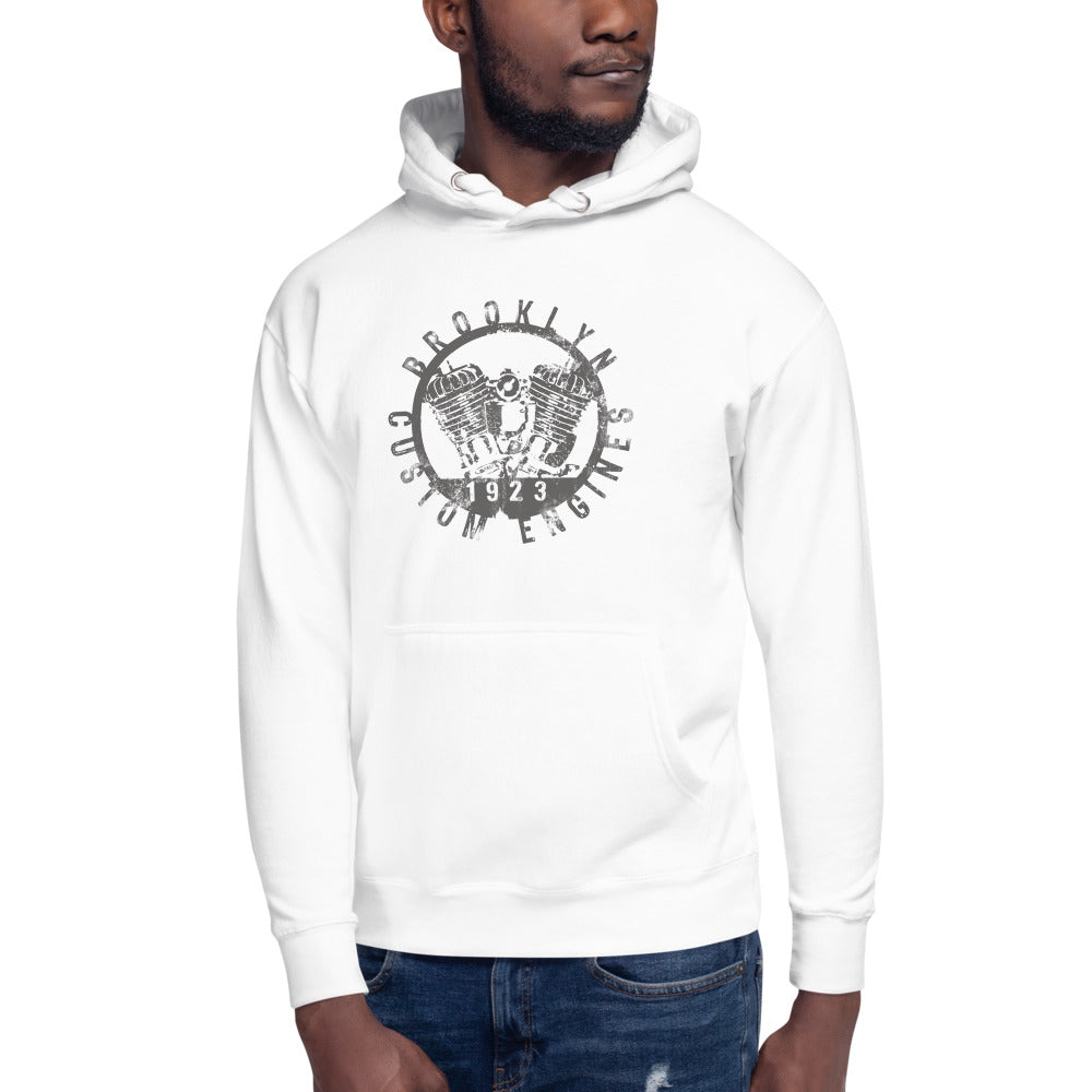
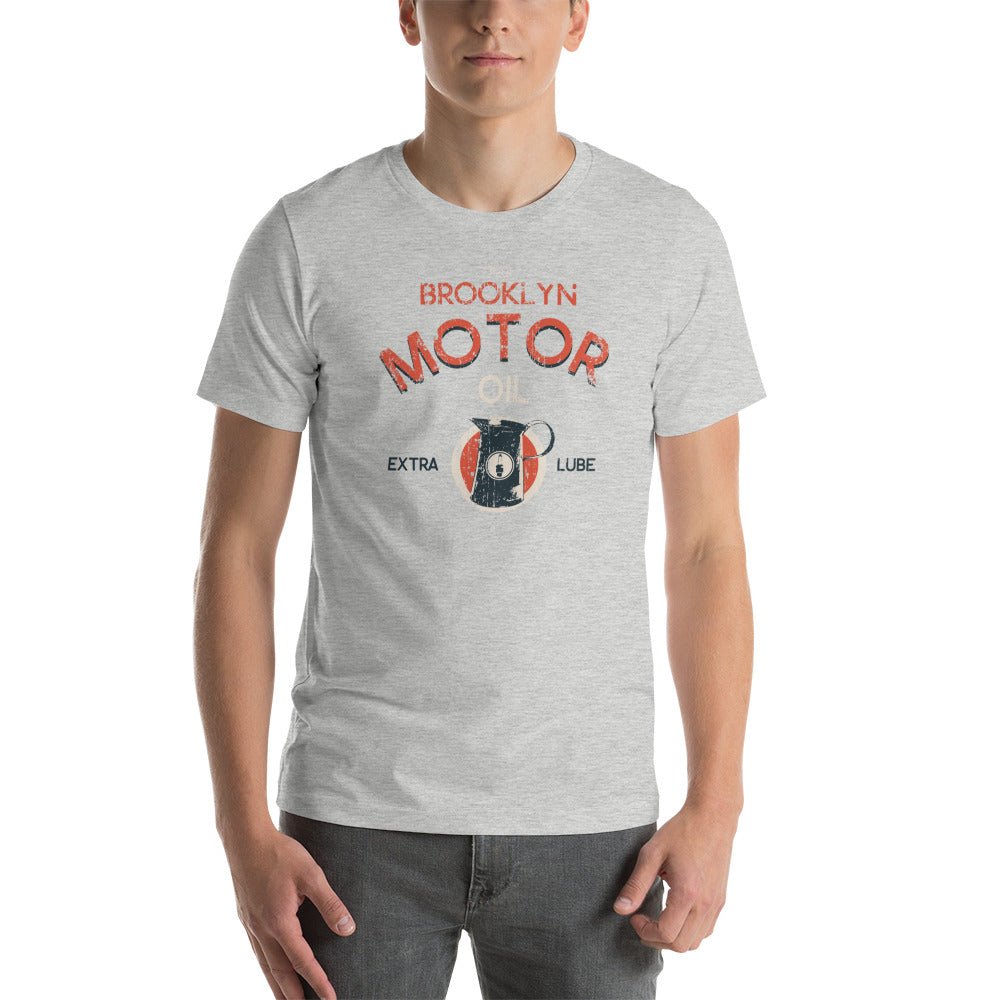
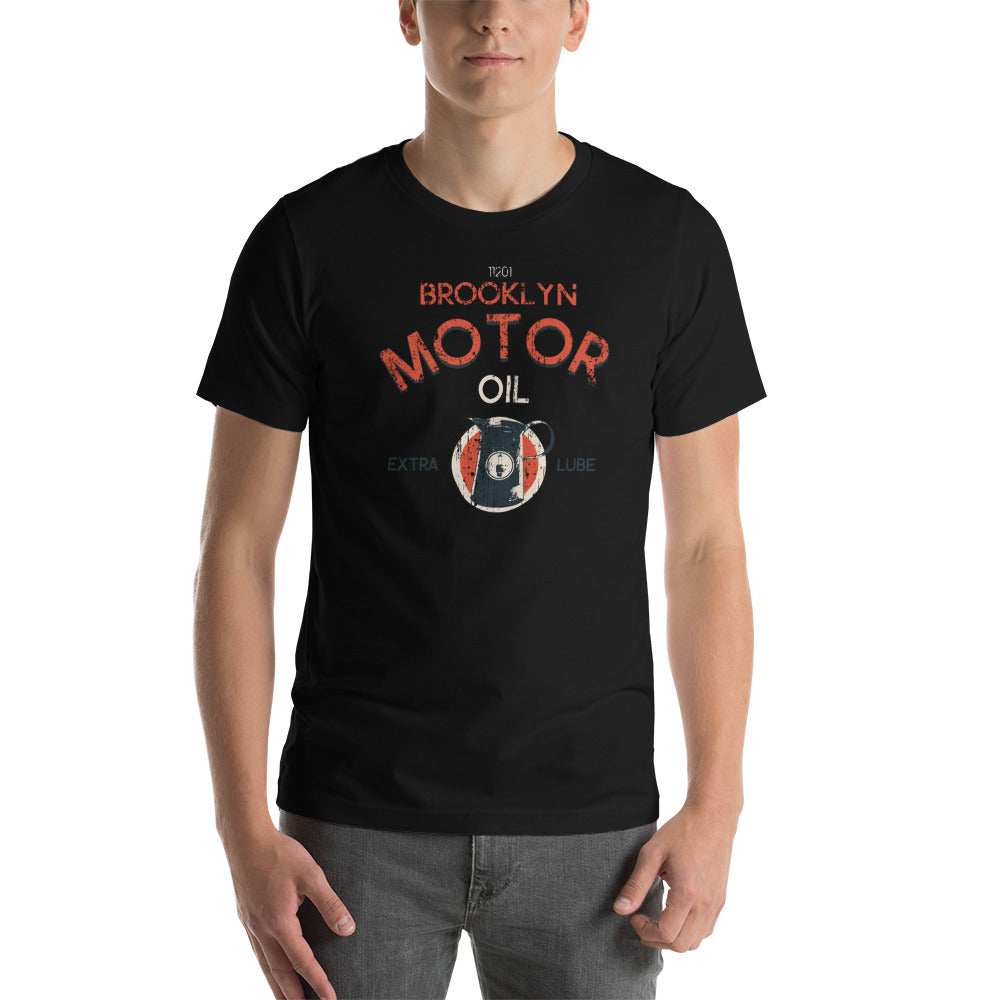
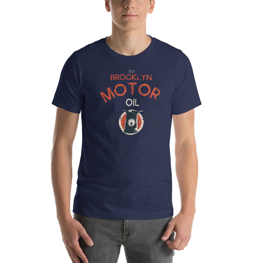
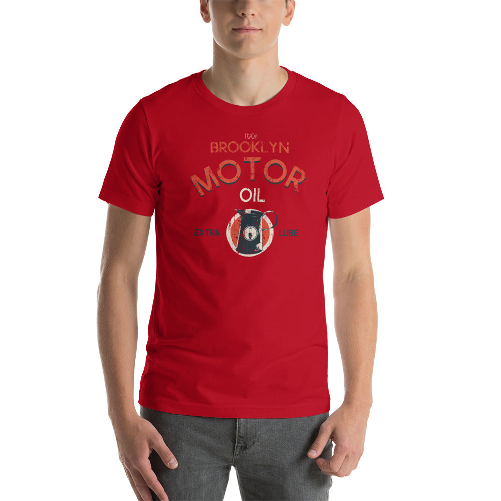
A statement graphic tee is something different. It carries a specific visual language, references something real, and holds up to a second look. Here's what separates one from the other — and why the BklynMotors motor club aesthetic is built on design with actual roots.
Where the Motor Club Aesthetic Comes From
American motorcycle club graphics developed their visual language between the 1940s and 1970s. The format was practical: a patch on a vest needed to be readable at distance, identifiable at a glance, and durable enough to survive the road. That meant bold typography, high-contrast imagery, strong outlines, and a central graphic that communicated identity without words.
That's the design lineage that BklynMotors tees are built from. Not nostalgia as a pose. An actual tradition with 70 years of visual history behind it.
What Makes a Graphic a Statement
Three things separate a statement graphic from noise:
Specificity. The Flatbush Fighters graphic isn't a generic vintage design. It references a specific neighborhood in Brooklyn with a specific identity. The design earns its place because it's about something real — not an approximation of cool.
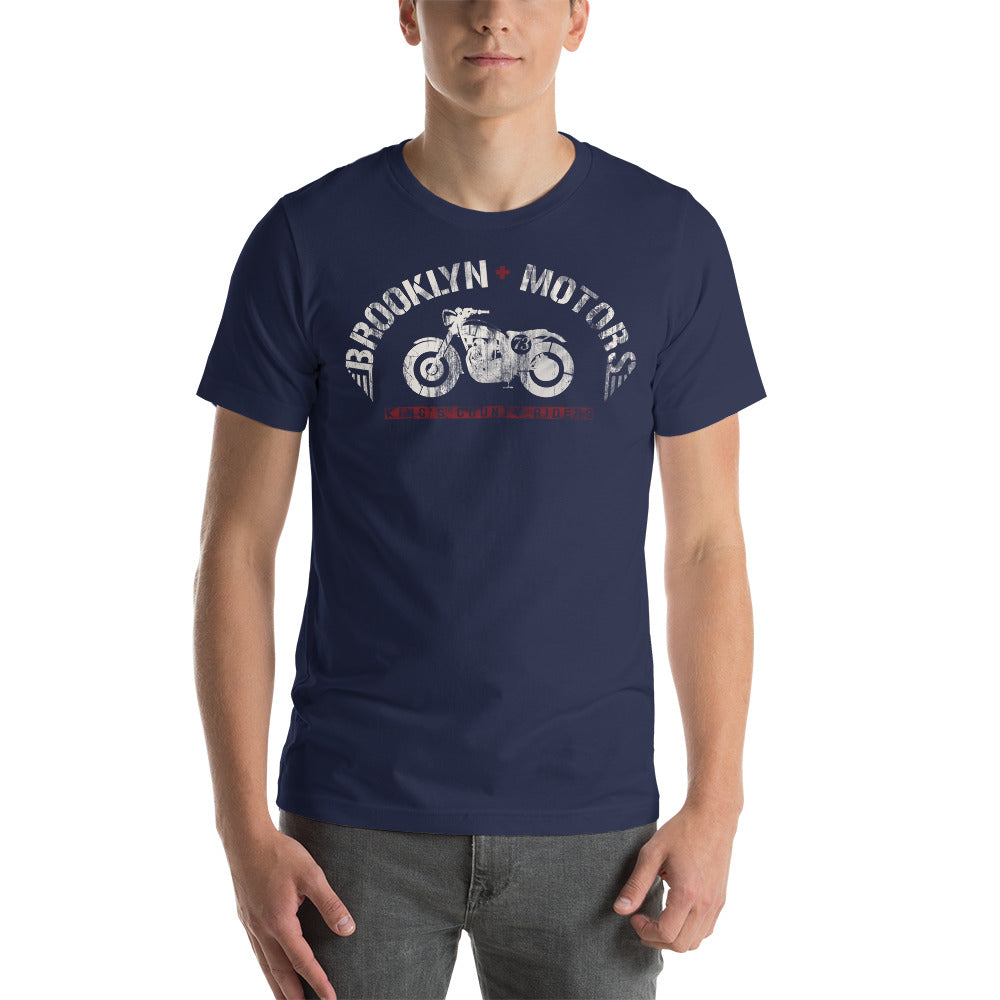
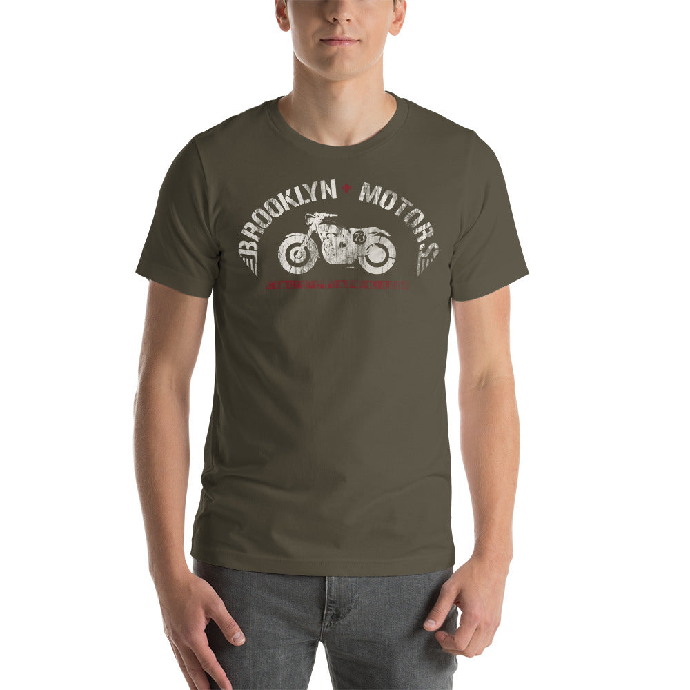
Composition. The Kings County Riders V2 layers type, imagery, and distressed texture in a way that holds attention on a second look. It's not one element — it's a design system that works as a whole.
Restraint. The King of Spades doesn't try to say everything. One image. Strong type. High contrast. The statement comes from what's there and what's left out.
Why the Neighborhood Series Works
Brooklyn isn't a backdrop. It's the material. Each BklynMotors neighborhood tee — Flatbush, East New York, Crown Heights, Canarsie, Red Hook, Williamsburg — draws its design language from the specific history and identity of that neighborhood. The graphics aren't interchangeable. They're designed for the place they represent.
That's the difference between a statement and decoration. When the graphic is grounded in something real, it earns the attention it gets.
Wearing It
A statement tee does the work. The rest of the outfit doesn't have to. Dark denim, simple sneakers, nothing competing for attention. The graphic is already saying something — your job is not to drown it out.
The BklynMotors lineup is built for exactly that. Airlume combed and ring-spun cotton, prints that hold their definition over years of wear, and graphics rooted in a real design tradition. Put it on. Keep everything else quiet.