How to Style a Graphic Tee Without Trying Too Hard

The graphic tee is the easiest thing in men's fashion to get wrong.
Too big. Wrong colors fighting each other. Too much going on everywhere else in the outfit. Most guys have been there. The tee that looked cool on the hanger ends up looking like you're not quite sure what you're doing.
Here's the thing: the rules aren't complicated. The guys who pull it off consistently aren't doing anything mysterious. They just understand a few fundamentals — and they're not ignoring them.
The Tee Has to Earn Its Place
In 2026, graphic tees are bigger than ever — but not all graphics are equal. Style guides and menswear editors consistently separate graphic tees into two categories: ones that have something to say, and ones that are just noise.
The Essential Man calls it "The Museum Rule." Ask yourself: could this image be framed and hung on a wall? If yes — abstract, meaningful, character-driven — you have something worth building an outfit around. If it's a brand logo or novelty print, you're working with something more casual and need to treat it that way.
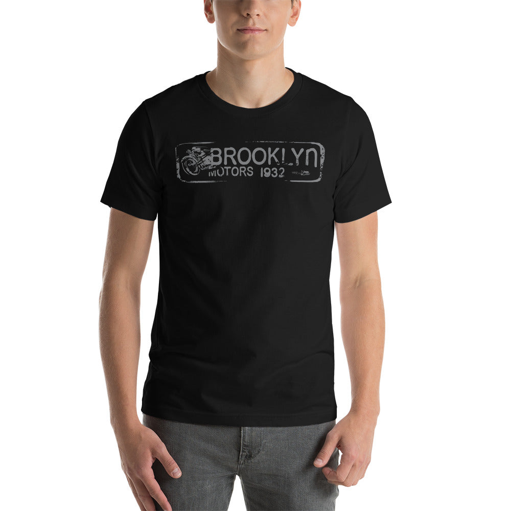
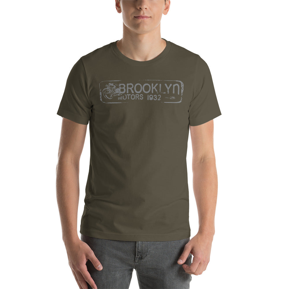
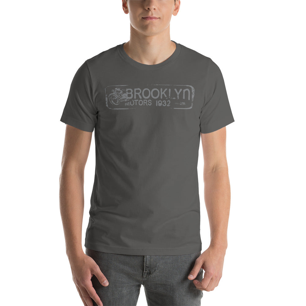
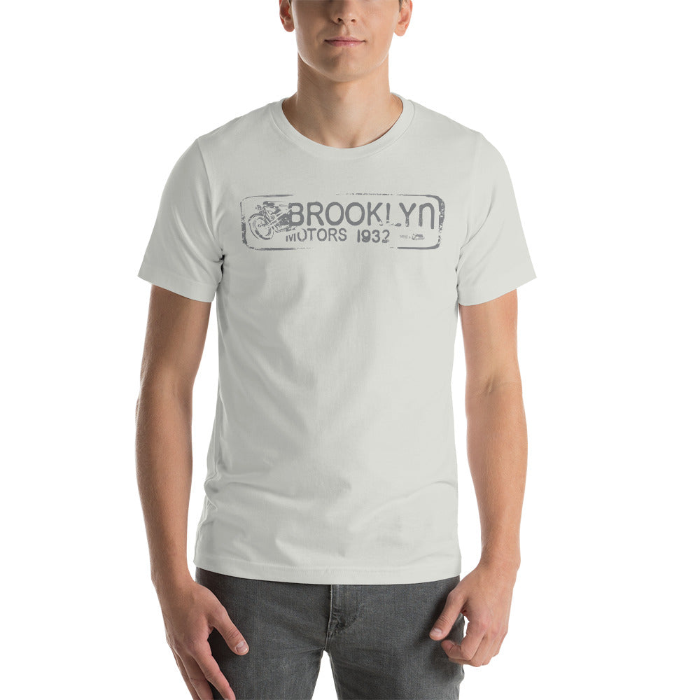
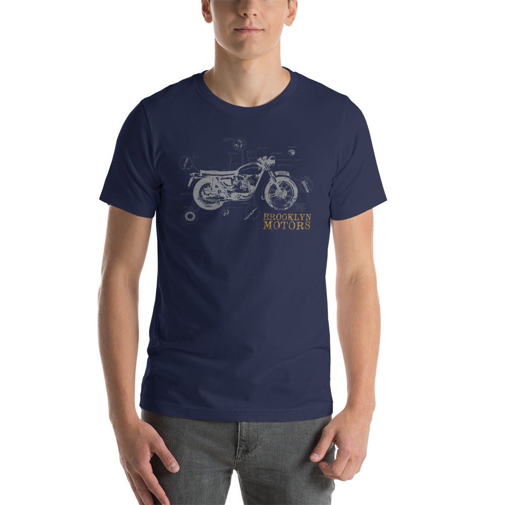
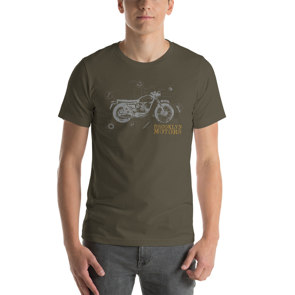
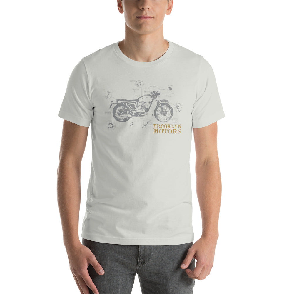
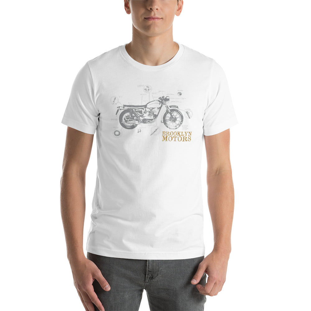
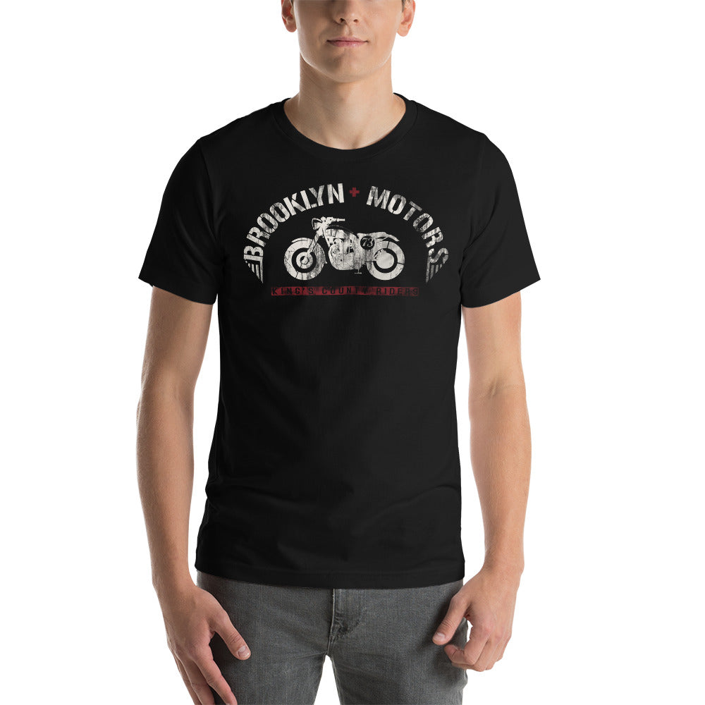
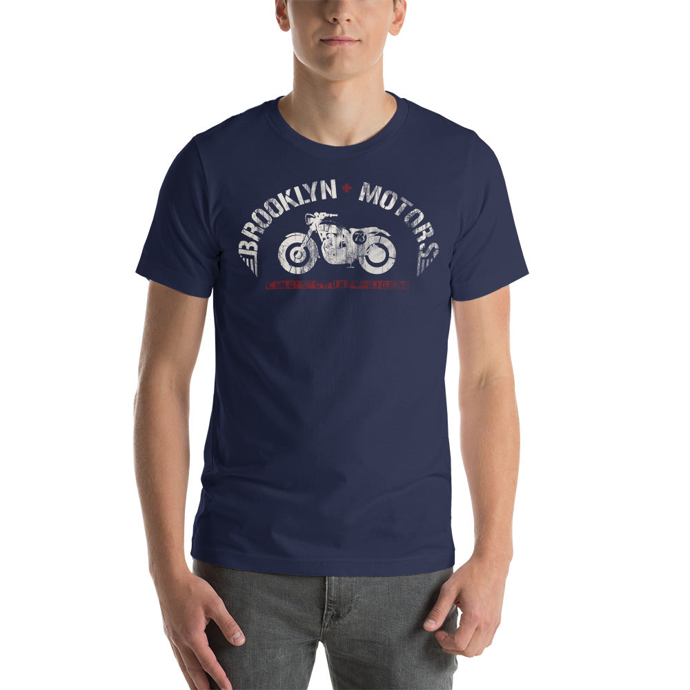
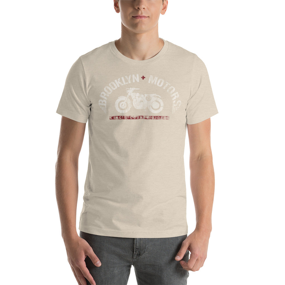
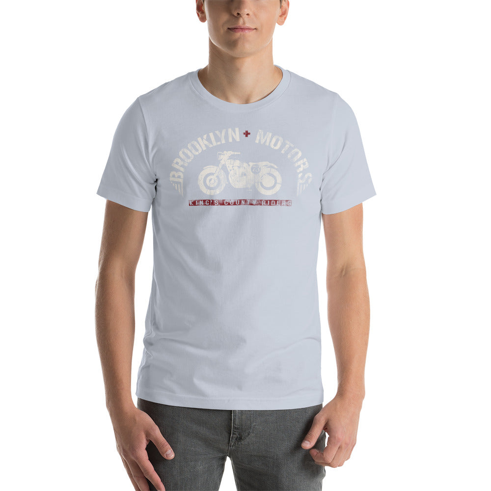
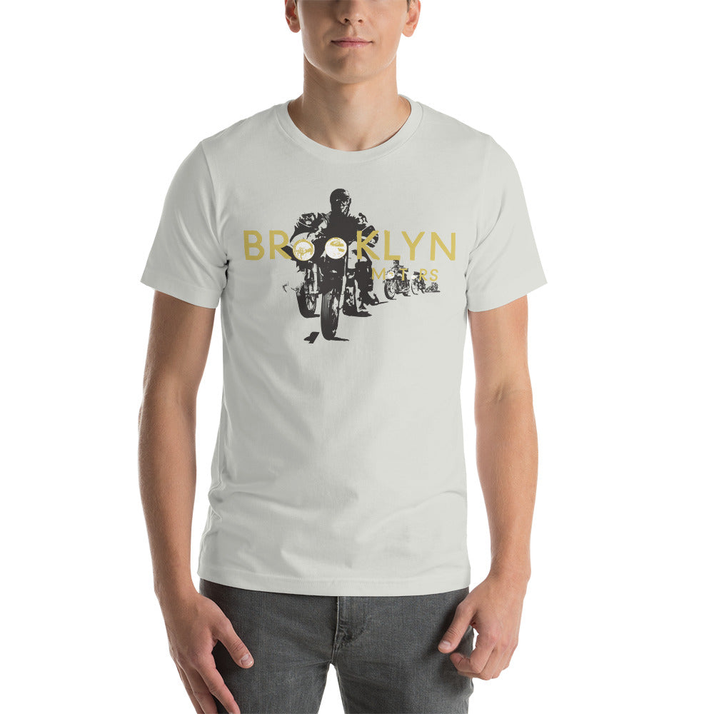
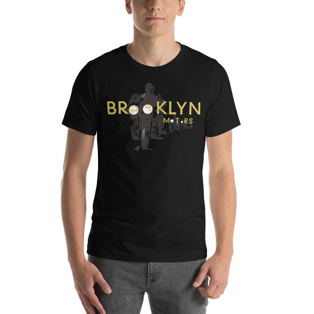
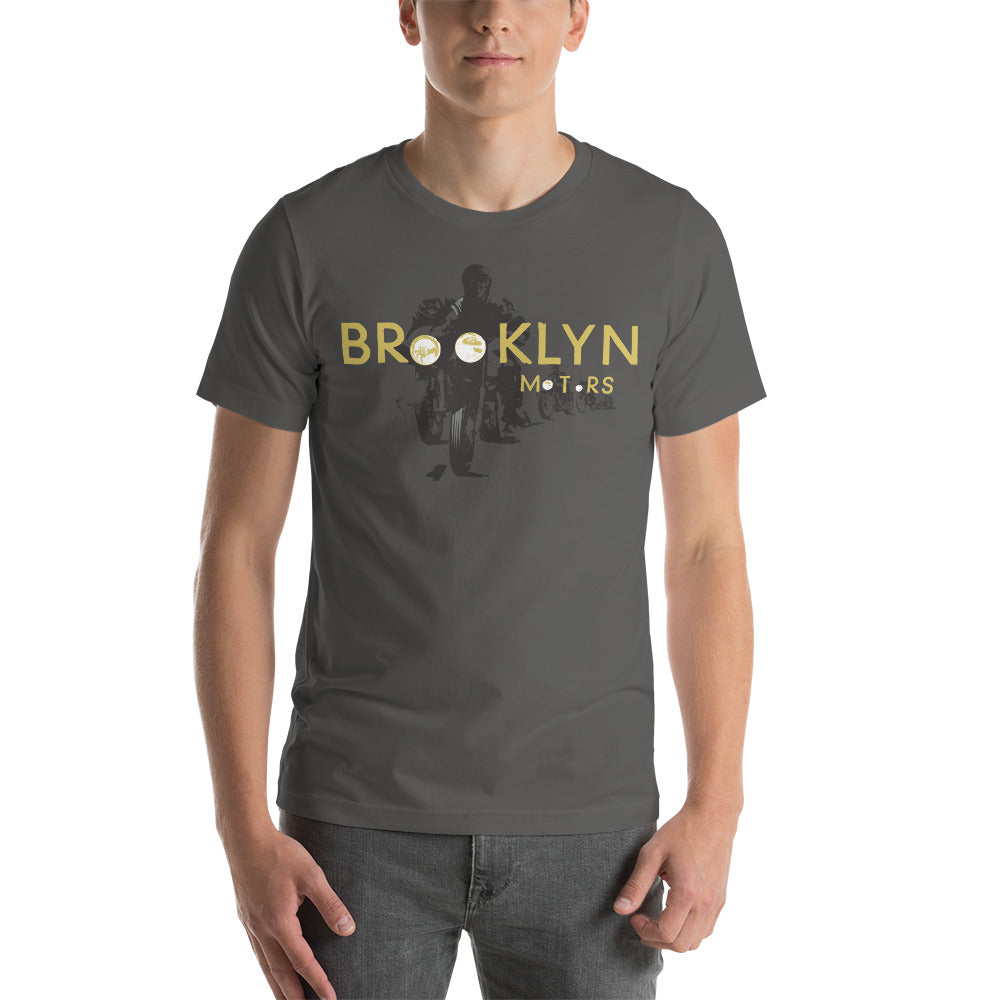
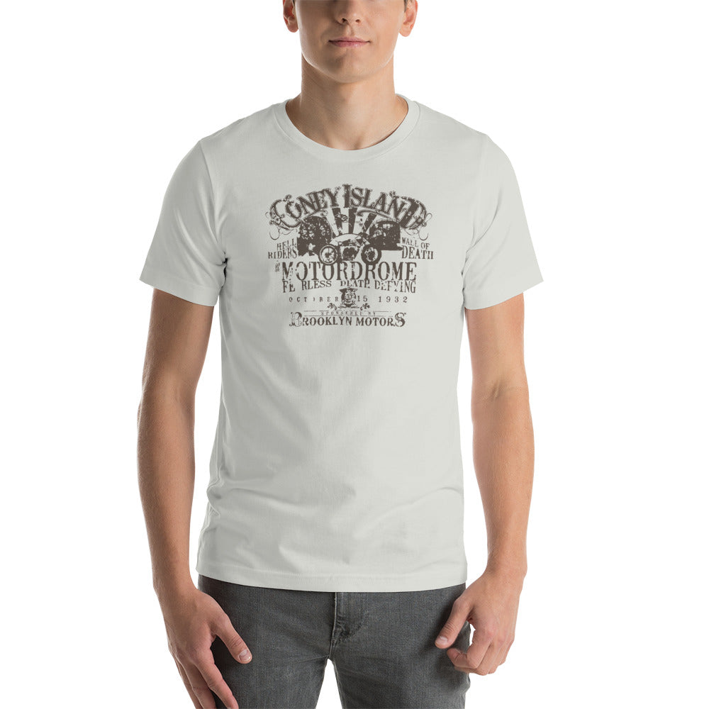
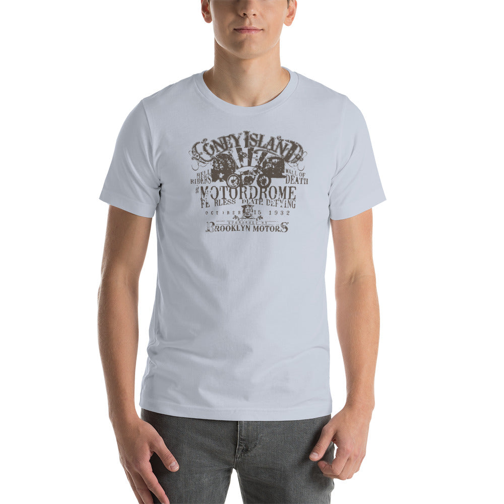
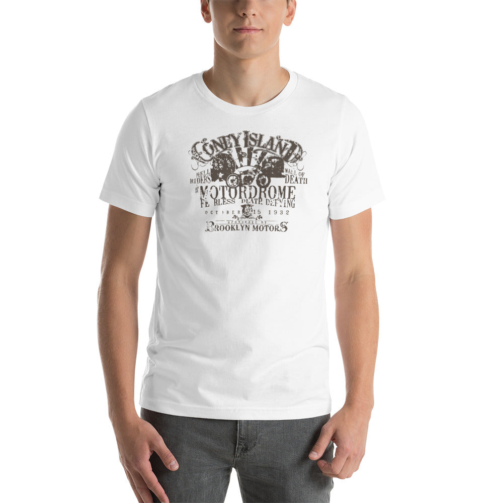
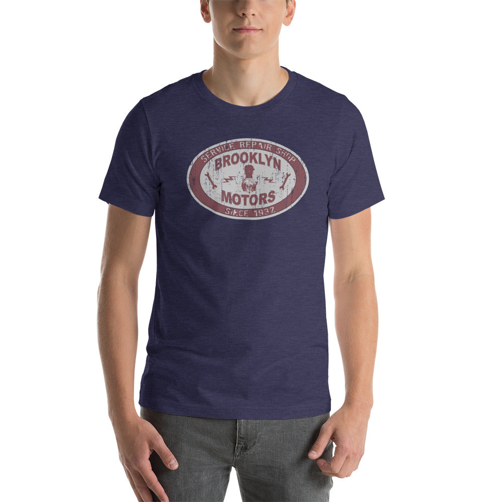
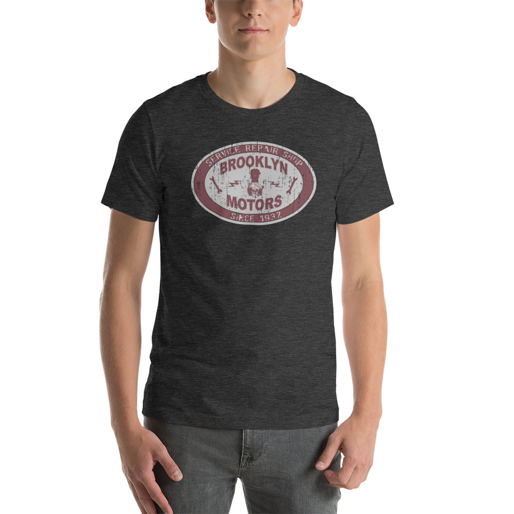
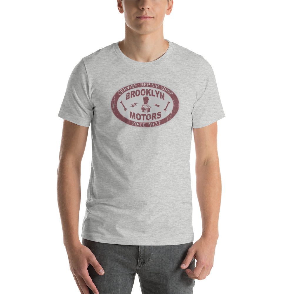
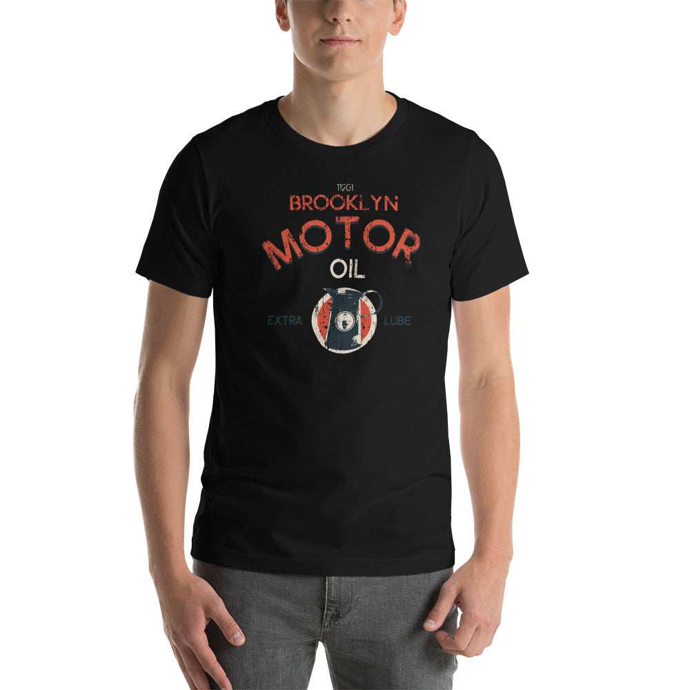
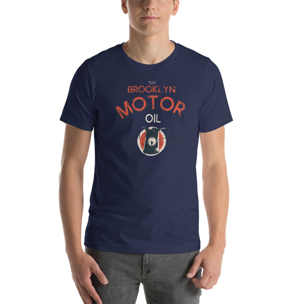
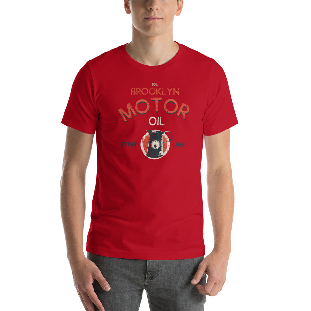
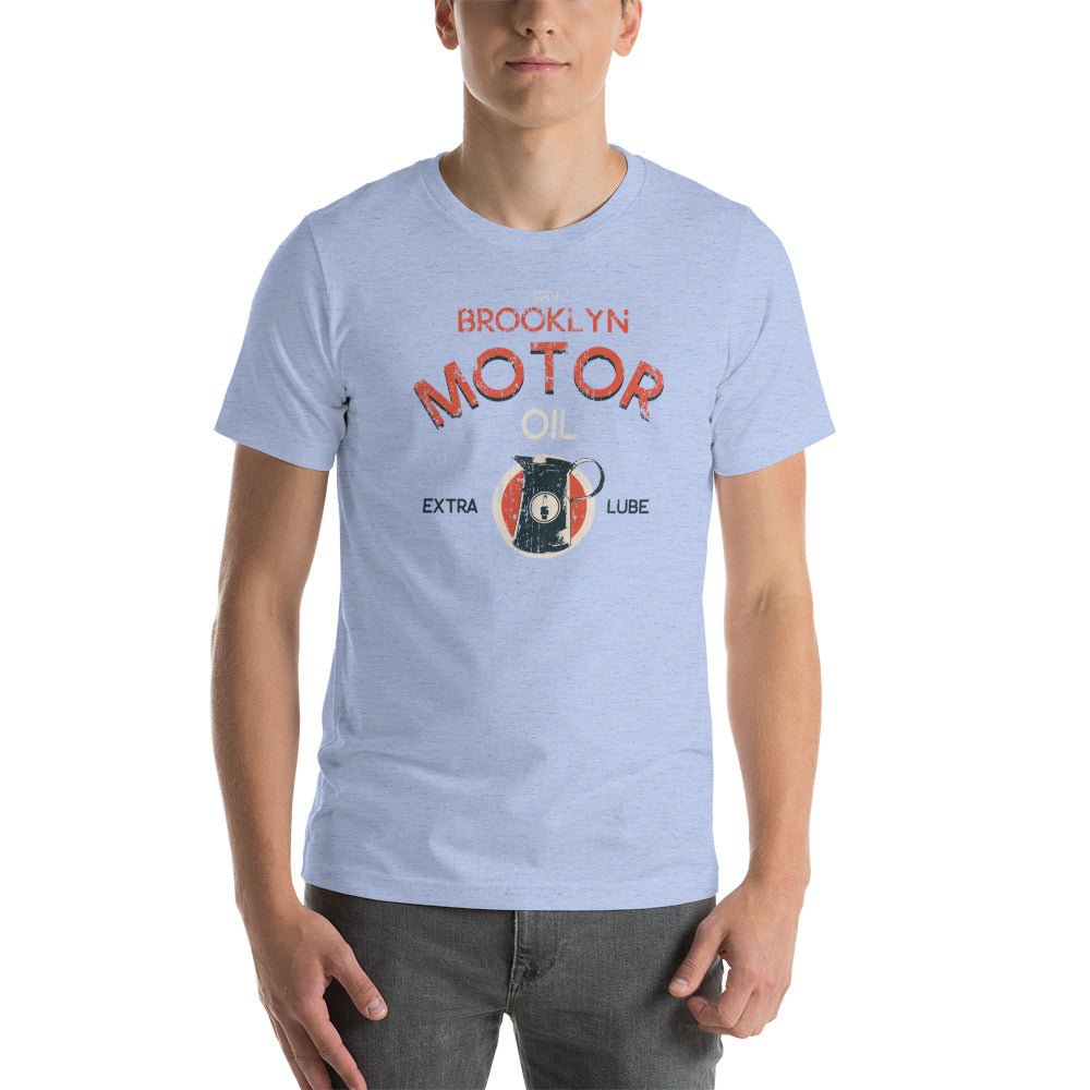
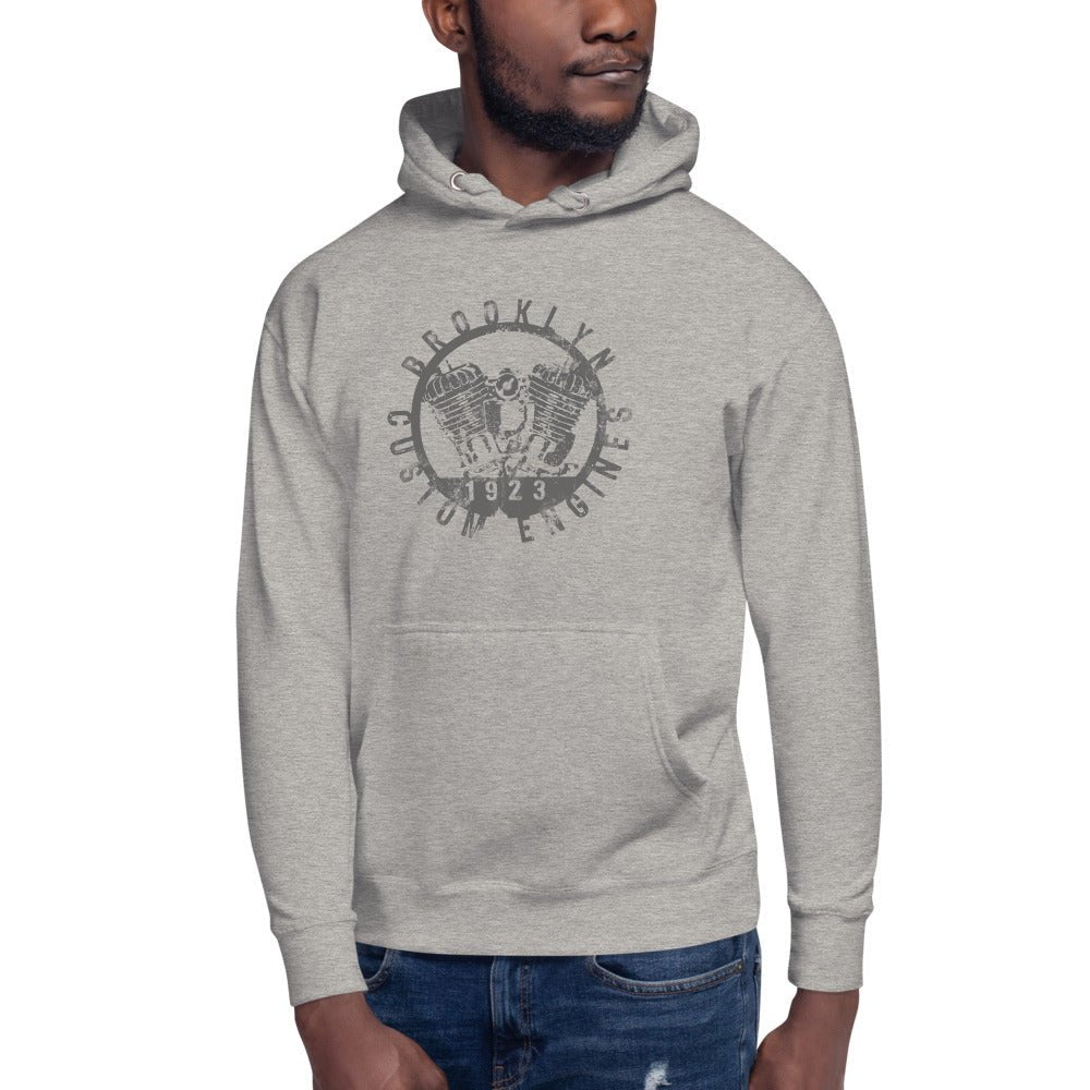
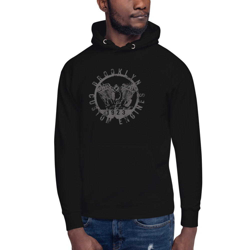
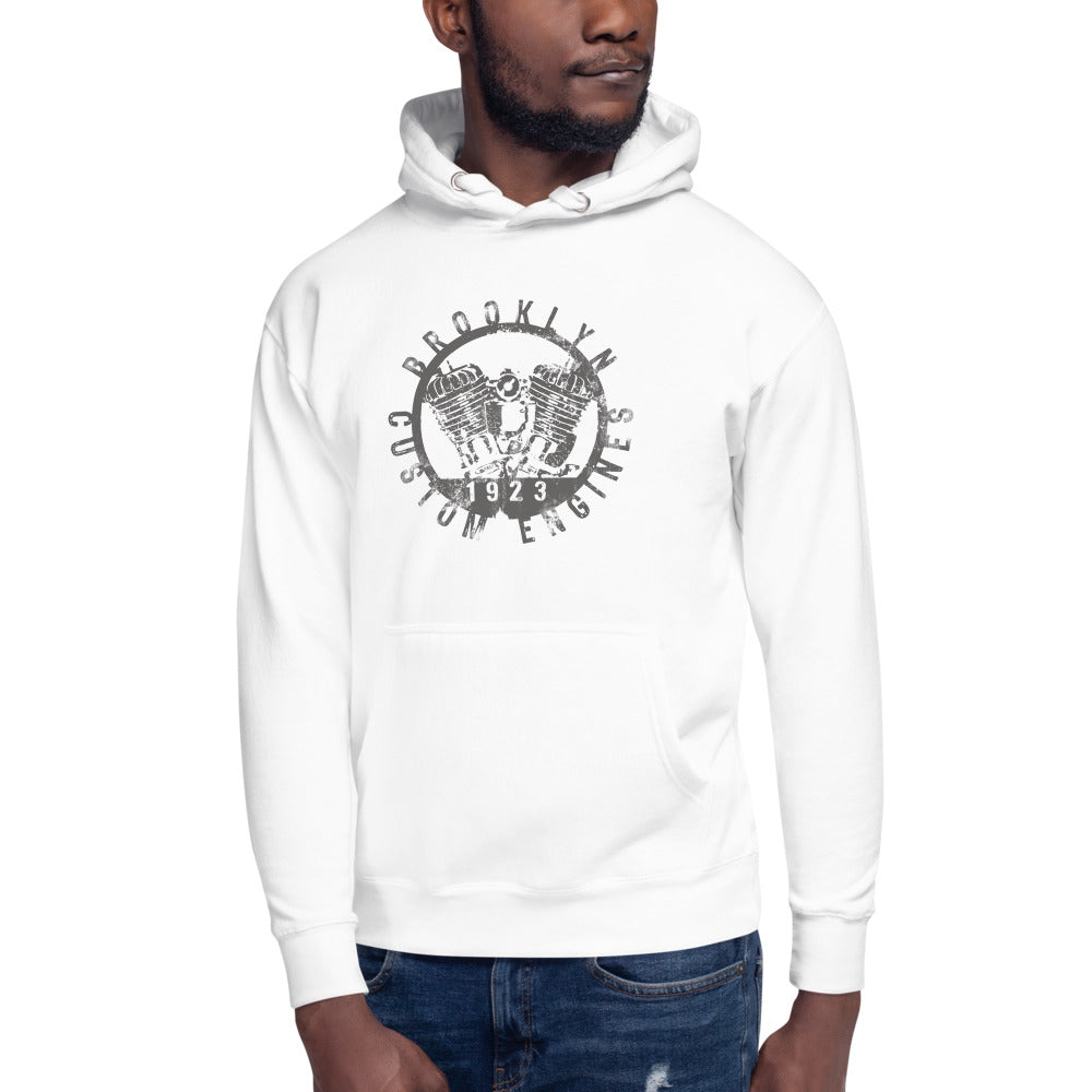
Vintage inspired graphics — worn-in quality, heritage design language, real character — sit at the top of that scale. The Kings County Riders V2 is exactly that. It pulls from Brooklyn's moto club era. The distressed printing, the typography, the composition — this isn't a graphic asking for attention. It commands it.
Start with a tee that deserves to be seen.
Fit: The Non-Negotiable
Every credible styling guide says the same thing: fit is where most men fail with graphic tees.
The rule from Real Men Real Style: you should be able to pinch — not pull — one to two inches of fabric on either side of your torso. The hem should fall around your hip, no lower than the top of your back pocket. If it's covering your seat, it's too long.
The chest graphic should sit flat. Sleeves should end near mid-bicep. Nothing bunching, nothing pulling.
Most vintage inspired cuts run slightly relaxed by design. If you're between sizes, size down.
What to Wear It With
Dark Denim or Chinos
The most consistently recommended pairing across every 2026 style guide. Dark denim in indigo, black, or charcoal creates contrast without competing with the graphic. Slim or straight leg both work. Avoid anything too distressed — one focal point, and the tee is it. Chinos in olive, tan, or navy serve the same purpose.
Footwear: Casual but Considered
Minimalist sneakers in white or black are the move — white if your tee has a light base, black if it's dark. The shoe shouldn't pull focus. Chelsea boots and derby shoes work when you want to push slightly more elevated; pair with jeans, not trousers. In 2026 streetwear, chunky runners and classic Vans are both strong choices. Per Urban City Styles: your shoe sets the energy of the whole outfit. Choose accordingly, then build up.
Layering: Open, Not Smothering
Layering is one of the dominant moves in men's streetwear right now. A denim jacket worn open, a light bomber, an unstructured overshirt — all work. Key word: open. You're adding structure, not covering the graphic. And no competing graphics on the layer — a bold print on the jacket cancels out the tee.
What to Avoid
Colored or patterned backgrounds on the tee — A black or white base lets the graphic breathe. A colored background creates visual competition before you've even gotten dressed.
Oversizing beyond the design intent — Oversized fits are trending, but only when that's the intention of the piece. A vintage graphic tee isn't cut to be worn three sizes up.
Over-accessorizing — A chain, a cap, stacked bracelets, loud sunglasses all at once? The tee disappears. One accessory, maybe none. The graphic is the statement.
Shorts if you're going anywhere beyond the block — Shorts drop a graphic tee into pure casual territory. Jeans keep it versatile for almost any setting.
The Move: Less Is More, Always
The guys who pull this off consistently have figured out one thing: a strong graphic tee does the work so the rest of the outfit doesn't have to.
Clean denim. Simple sneakers. Nothing fighting for attention. The tee is already saying something. Your job is to not drown it out.
The Kings County Riders V2 was built for exactly this. A graphic rooted in Brooklyn moto club history, a fit that works without adjustment, and a design that only gets better with wear. Put it on. Keep everything else quiet. That's the whole move.